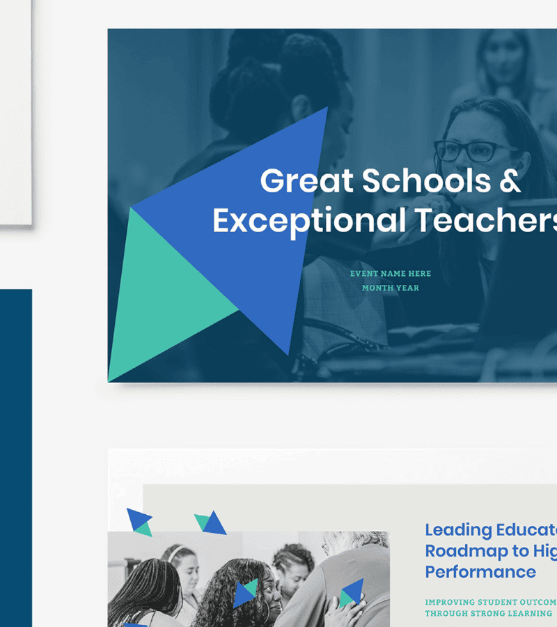
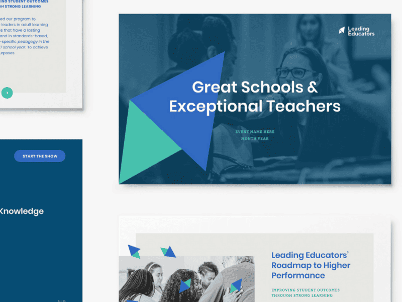
A rebrand that opens a new chapter for leadership in education
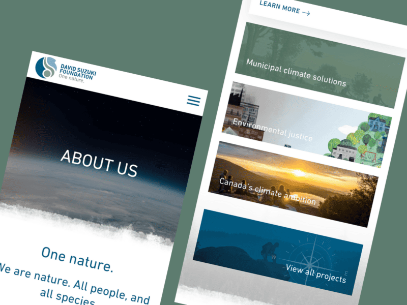
Our client partners
We partner with non-profit organizations, foundations, governments, and purpose-driven businesses working towards making the world a better place. Together, we craft compelling stories, engage audiences and inspire social change.
Awards
Our forward-thinking approach, authentic brands, and powerful digital experiences have earned us accolades across disciplines and beyond borders.