NAUDL
A powerful rebrand for an organization that creates leaders for life.
Services
- Brand Architecture
- Brand Strategy and Messaging
- Collateral Design
- Brand Guidelines
- Branding
- Logos and Visual Identity Systems
Empowering students through the power of debate
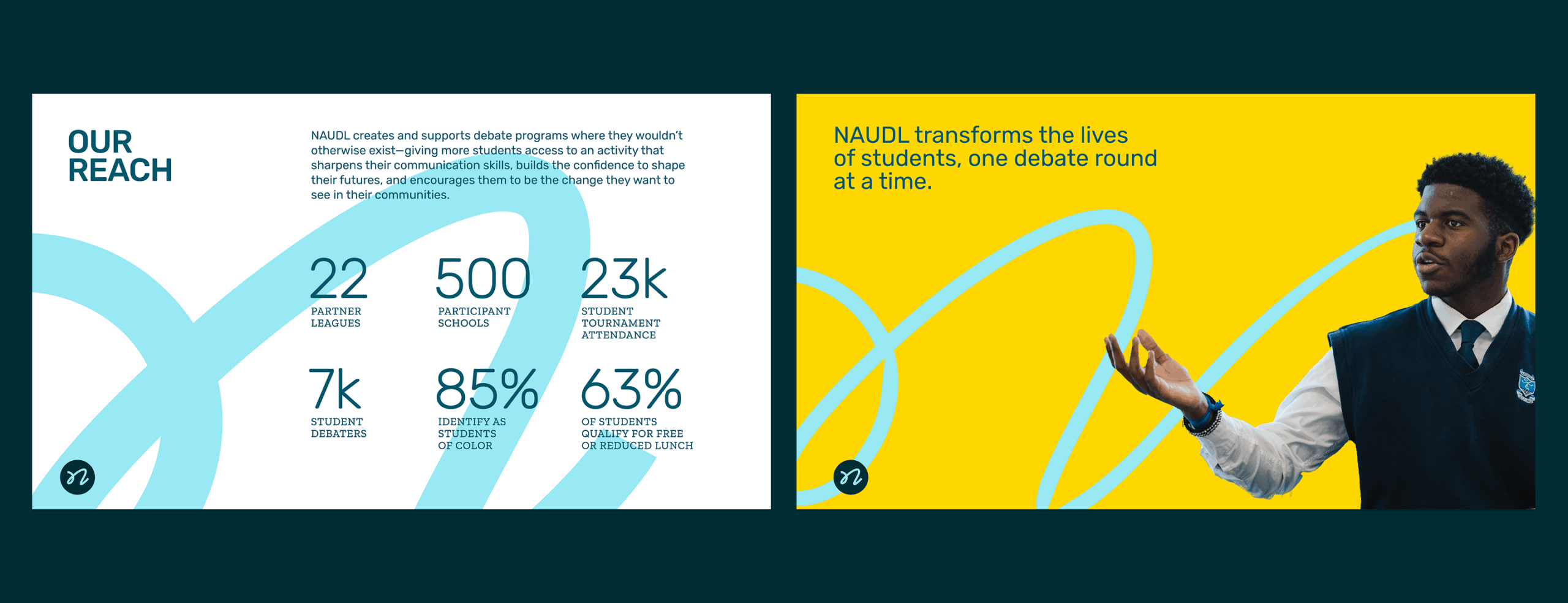
The National Association for Urban Debate Leagues (NAUDL) creates and supports public school debate programs where they wouldn’t otherwise exist—expanding access to an activity that sharpens communication skills, builds confidence, and empowers students to shape their futures. As they approached their 20th year, NAUDL turned to Briteweb for a fresh visual identity and a brand story that captures and reflects the power of their work.
Honoring two decades—and a bold future
Inspired by their upcoming landmark anniversary, NAUDL saw an opportunity to reconsider and refine how they present themselves. Because debate is still unfamiliar to many, the organization faced a tricky communications challenge. While its alumni, coaches, and long-time supporters had experienced the life-changing power of debate, many prospective students, educators, and donors still associated it with outdated stereotypes: a niche competition reserved for privileged kids. NAUDL had already long fought that stereotype by working with students from under-resourced schools across the country, but they needed a brand that backed up their actions with clear messaging and modern, inspiring visuals.
They also wanted a bolder way to communicate the benefits of debate. How could they continuously highlight student success stories? How could they get new potential debaters, coaches, and administrators excited about the opportunity to participate?
They knew that in an era of growing misinformation and shrinking investment in public education, the need for critical thinking skills development in young people would become more and more important. Our job was to help them demonstrate how the work they do creates the leaders we all need.
From after-school activity to lifelong opportunity
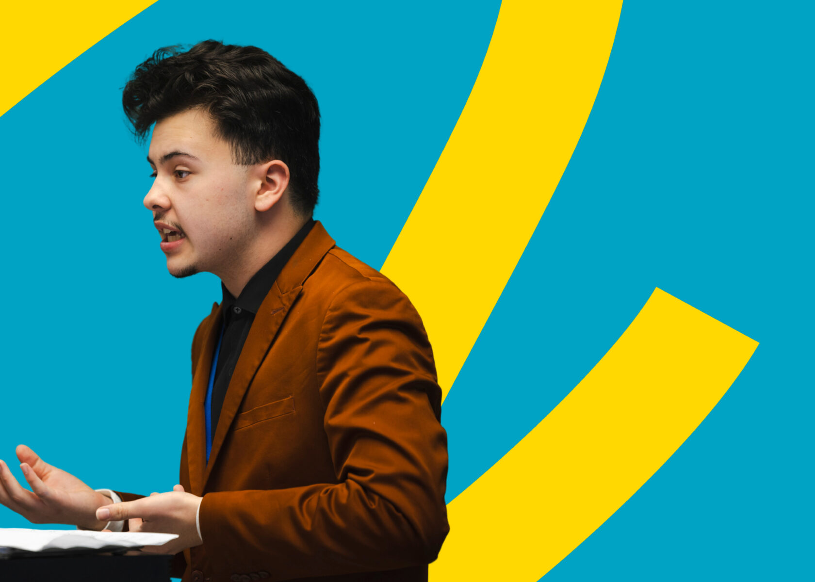
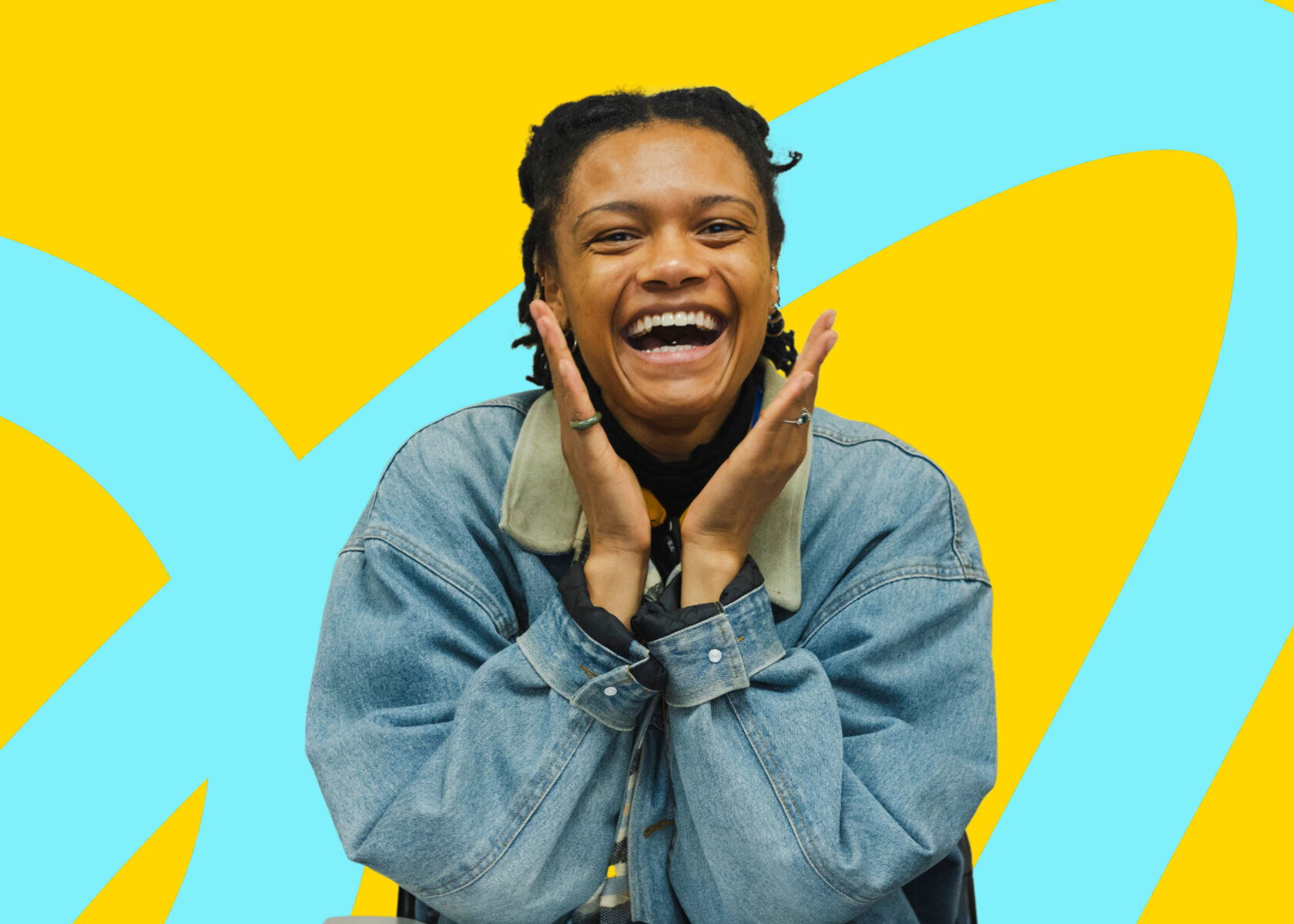
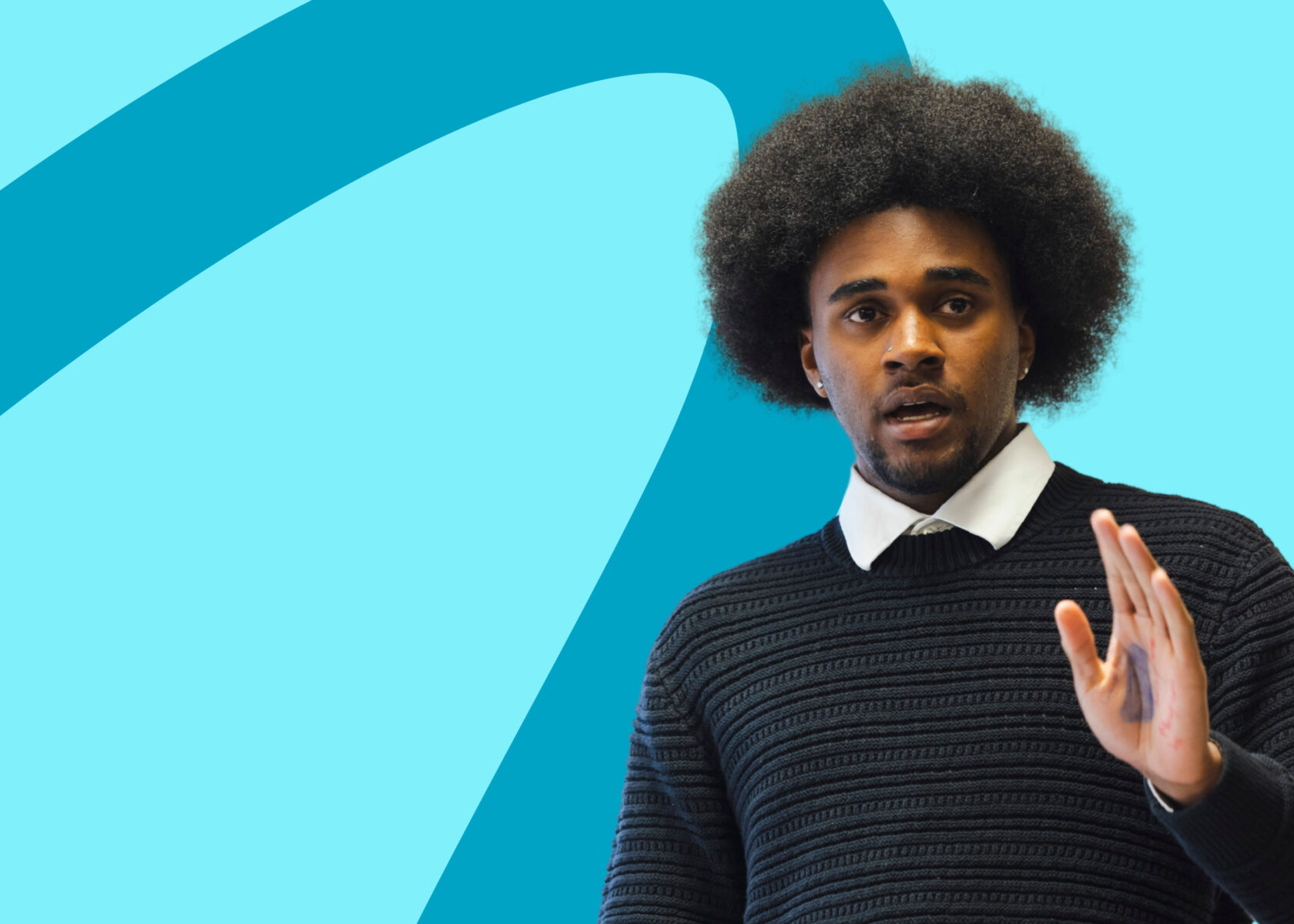
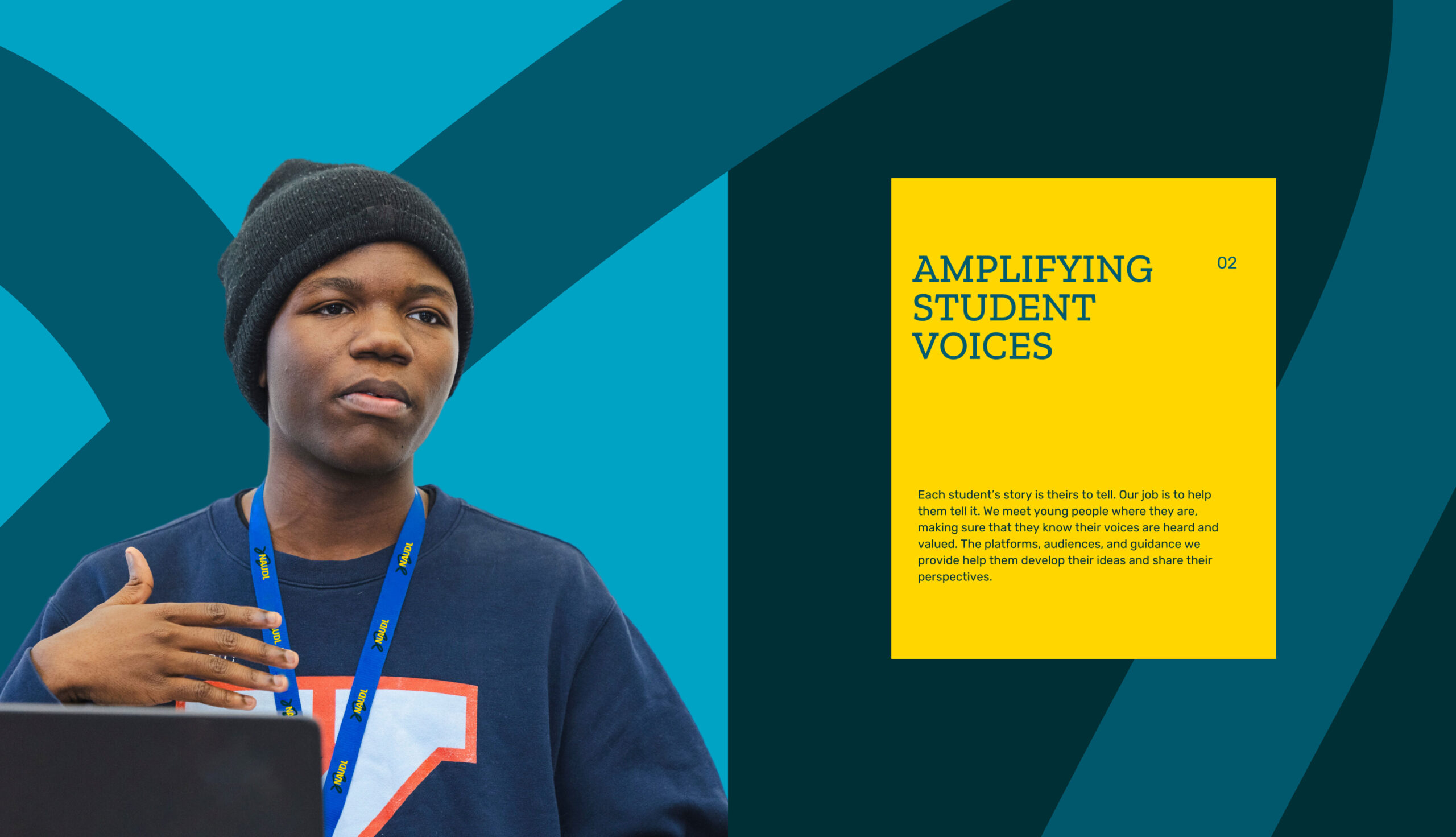
Our team began by listening, placing student and alumni perspectives at the center of our process. Their stories made it clear that debate is not only an academic exercise, but a community where young people feel seen and celebrated for being their authentic selves. Debate teaches them to examine evidence, command a room, and speak with confidence. It also offers belonging and support that extend far beyond a classroom. And students carried all of those benefits with them through every stage of their lives.
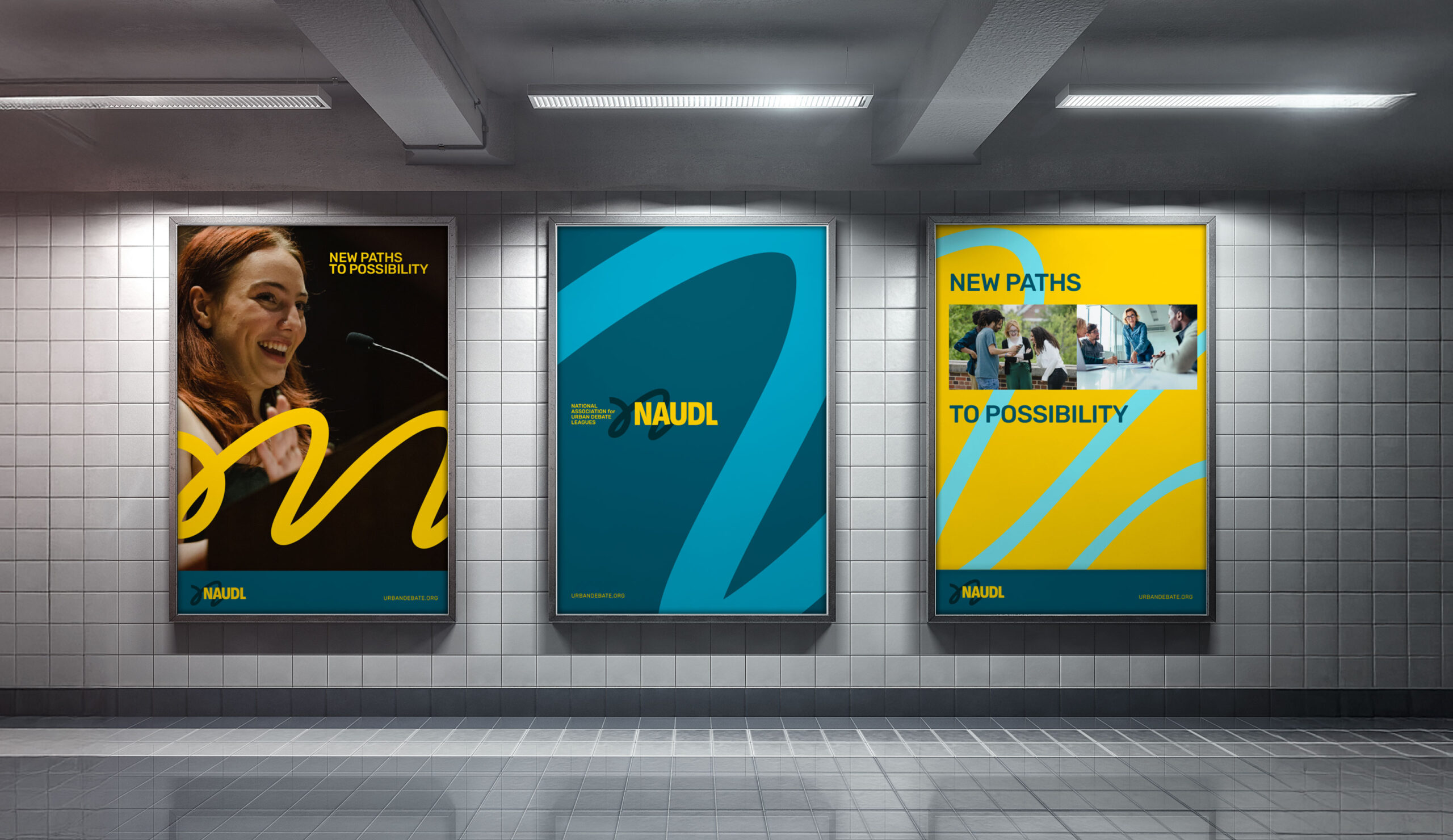
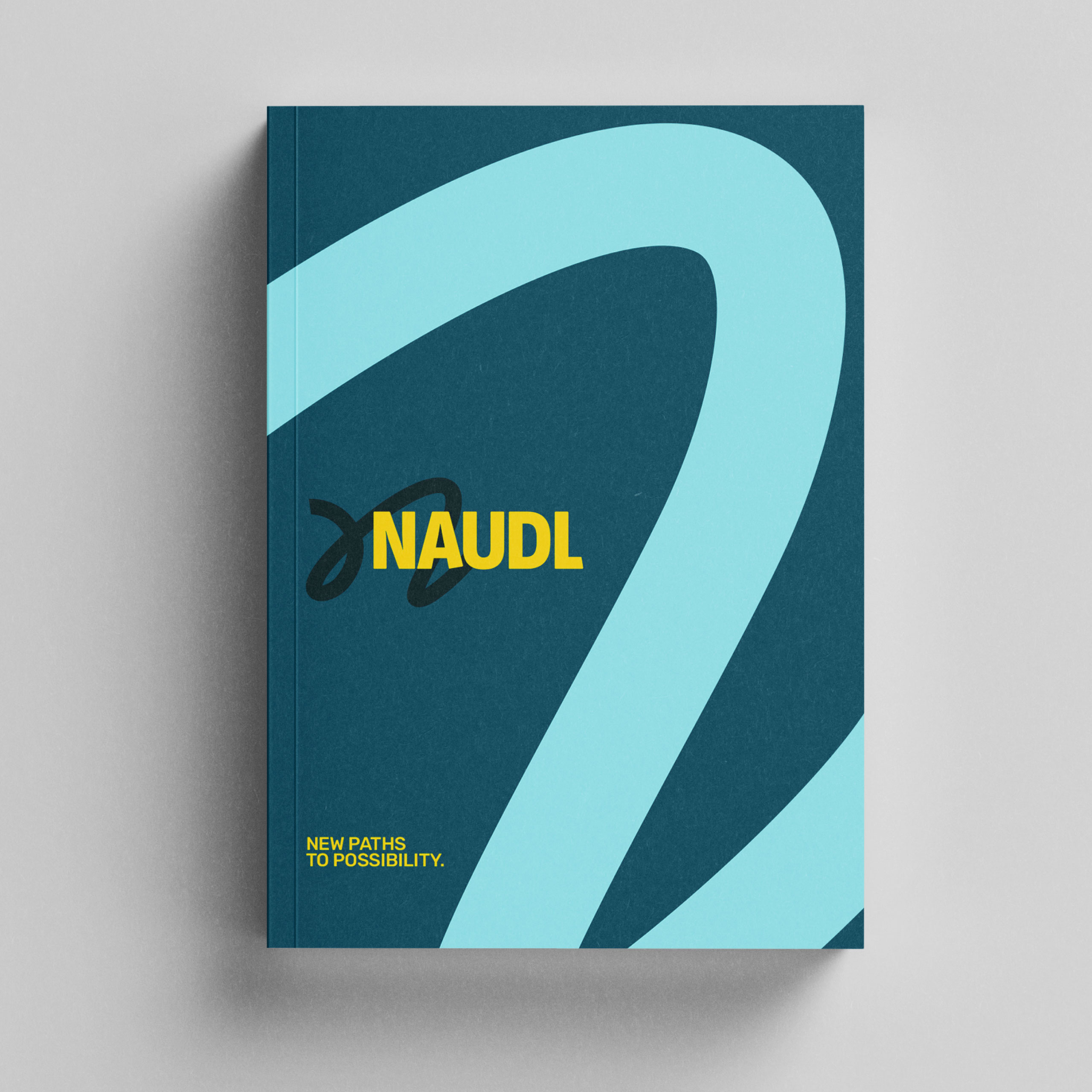
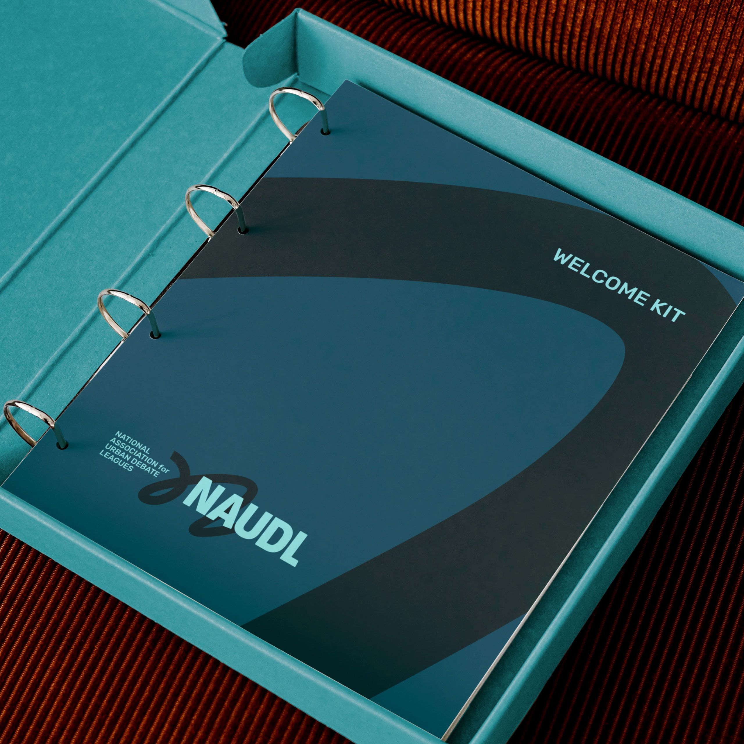
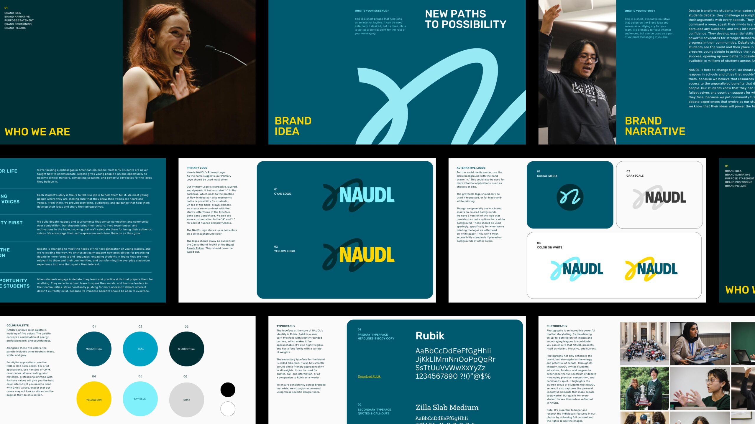
New Paths to Possibility
We set out to develop a big idea that would anchor a broad narrative, highlighting both the promise of NAUDL’s programming and the potential within every student. Framing debate as a journey—one that can lead to new opportunities and better outcomes—felt like a meaningful way to tell the story, with NAUDL offering an entry point for students’ first steps on their unique paths forward. We landed on ‘New Paths to Possibility,’ evoking a feeling of endless potential; we paired this idea with dynamic visuals that reflect the wide range of options that students can explore as they shape their futures.
Finding the flow
In debate, the term ‘flow’ refers to a note-taking method that tracks arguments and responses throughout a round. For visuals, we envisioned a dynamic path that could take any shape a student could dream of—inspired in part by a flow graphic as a symbol of expression, energy, and momentum. Paired with compelling photography of NAUDL students, the brand’s visual story began to take shape.
Core verbal brand elements that supported the big idea of ‘New Paths to Possibility’ included Brand Pillars, a Brand Narrative, a Positioning Statement, a Purpose Statement, and Audience-Specific Messaging.
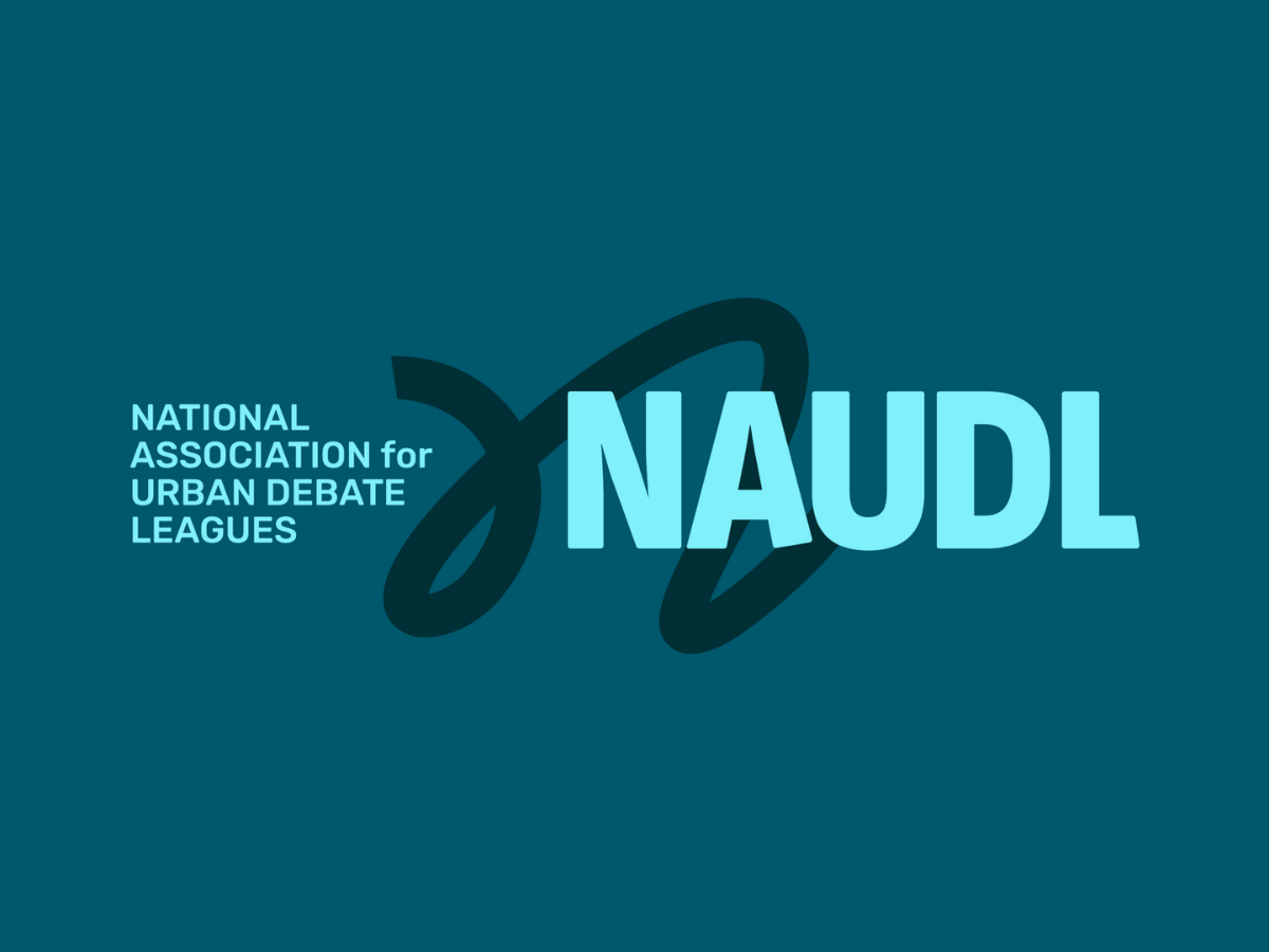
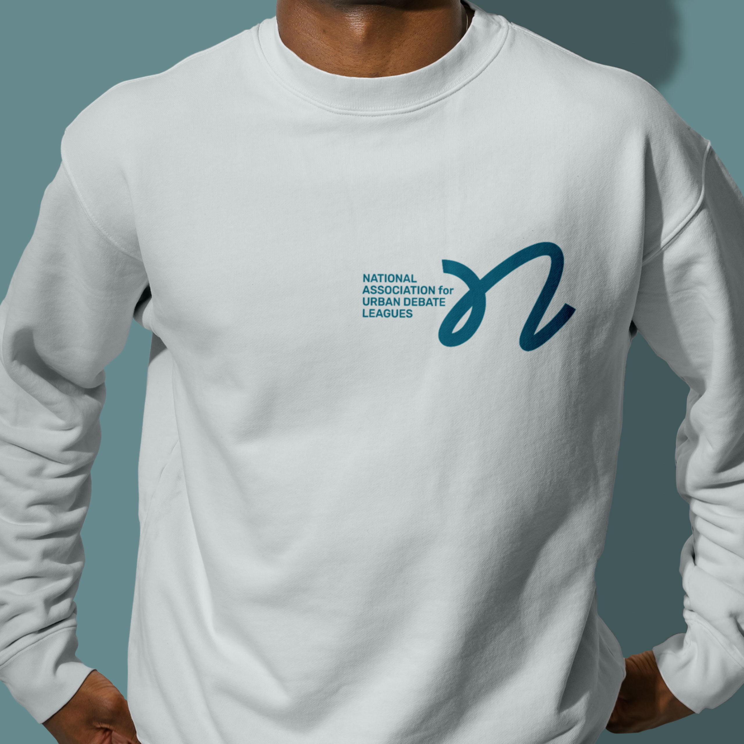
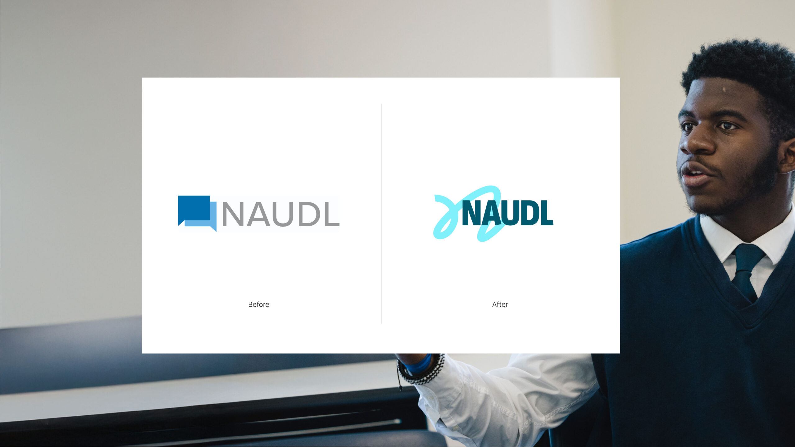
A bold, balanced logo
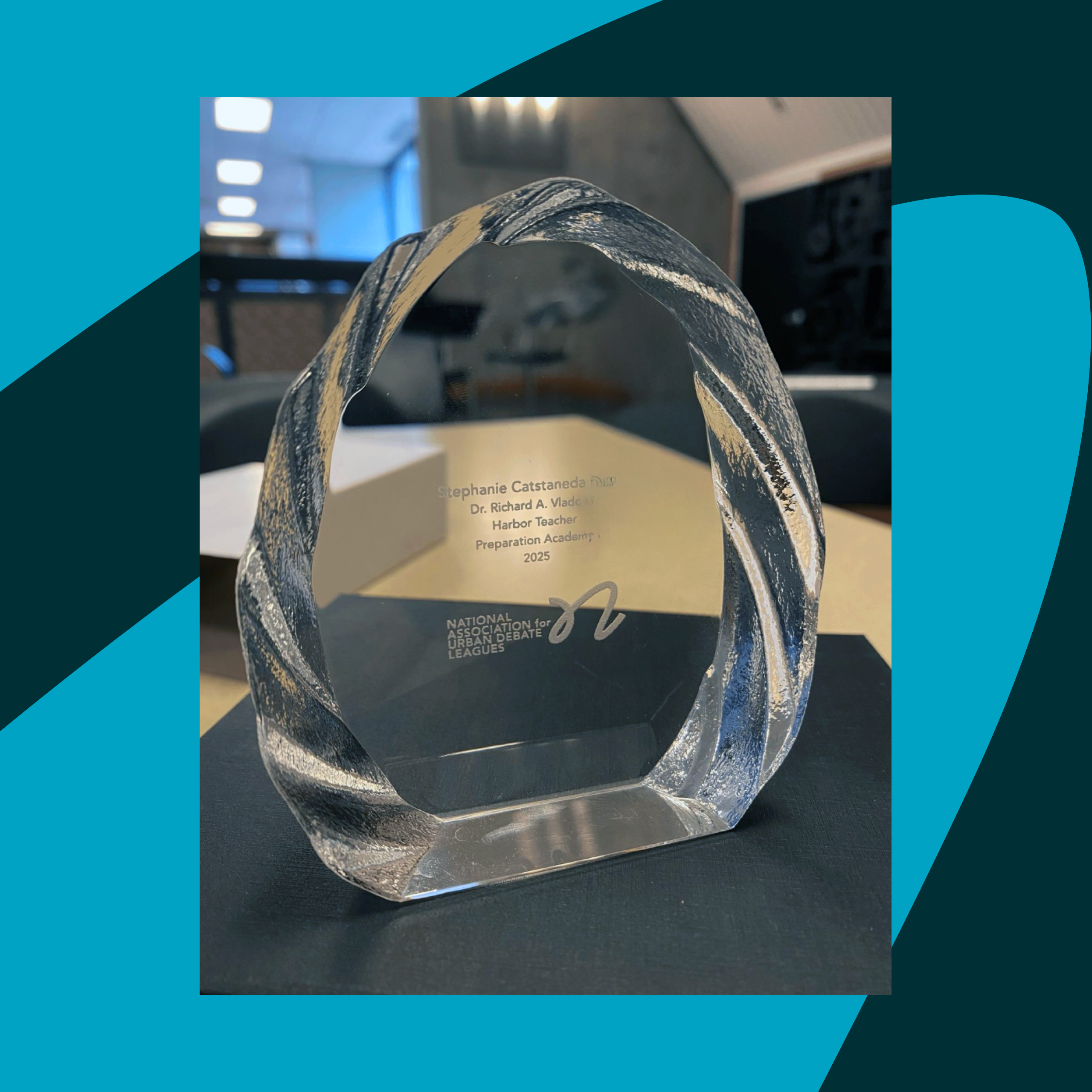
NAUDL’s logo is expressive, layered, and dynamic. It features a cursive ‘n’ behind a confident logotype, referencing the practice of ‘flow’ in debate and symbolizing the paths and possibilities available to students. The sturdy letterforms of Sofia Sans Condensed keep the wordmark grounded, while subtle customizations to the ‘A’ and ‘L’ introduce nuance and playfulness.
The color palette consists of five colors—primarily a range of cool and bright blues—complemented by an energetic yellow that invigorates the visual identity. This combination conveys a balance of energy, professionalism, and youthfulness, appealing to NAUDL’s diverse audiences.
Momentum for the next 20 years, and beyond
NAUDL’s rebrand challenged our team to look beyond typical perceptions of debate and lean into its powerful potential. The result is more than a brand system; it’s a platform for growth. With clear messaging, a cohesive visual identity, and the confidence to lead with student voices, NAUDL is ready to expand its impact and reach. It’s also primed to honor its commitment to evolving the practice of debate in order to meet the needs of present and future generations. The new brand positions the organization not just as a steward of urban debate leagues, but as a movement-builder—ensuring that more young people have the opportunity to discover their own paths to possibility.