Ribbon Community
A reimagined brand identity for a new era of HIV support, prevention, and care
Services
- Brand Strategy and Messaging
- Collateral Design
- Naming
- Branding
- Logos and Visual Identity Systems
Honouring the past, envisioning the future
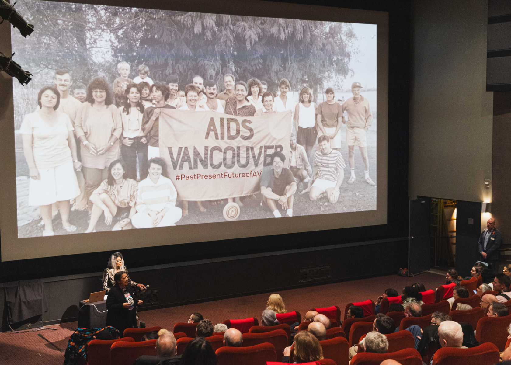
AIDS Vancouver was founded four decades ago, in the early days of the AIDS crisis. Since then, much has changed—societally, medically, and within the organization itself. They approached us needing a new name and brand fitting of HIV and AIDS today—one that reflects where the organization is headed while still honouring its proud history, and eras.
It’s not uncommon for an organization to revamp their brand identity at a moment of significance—AIDS Vancouver was celebrating 40 years as an organization, and grappling with shifts in who they are and whom they serve. A call for community feedback led to a visioning process that made it clear: it was time for a change.
A new name for a new era
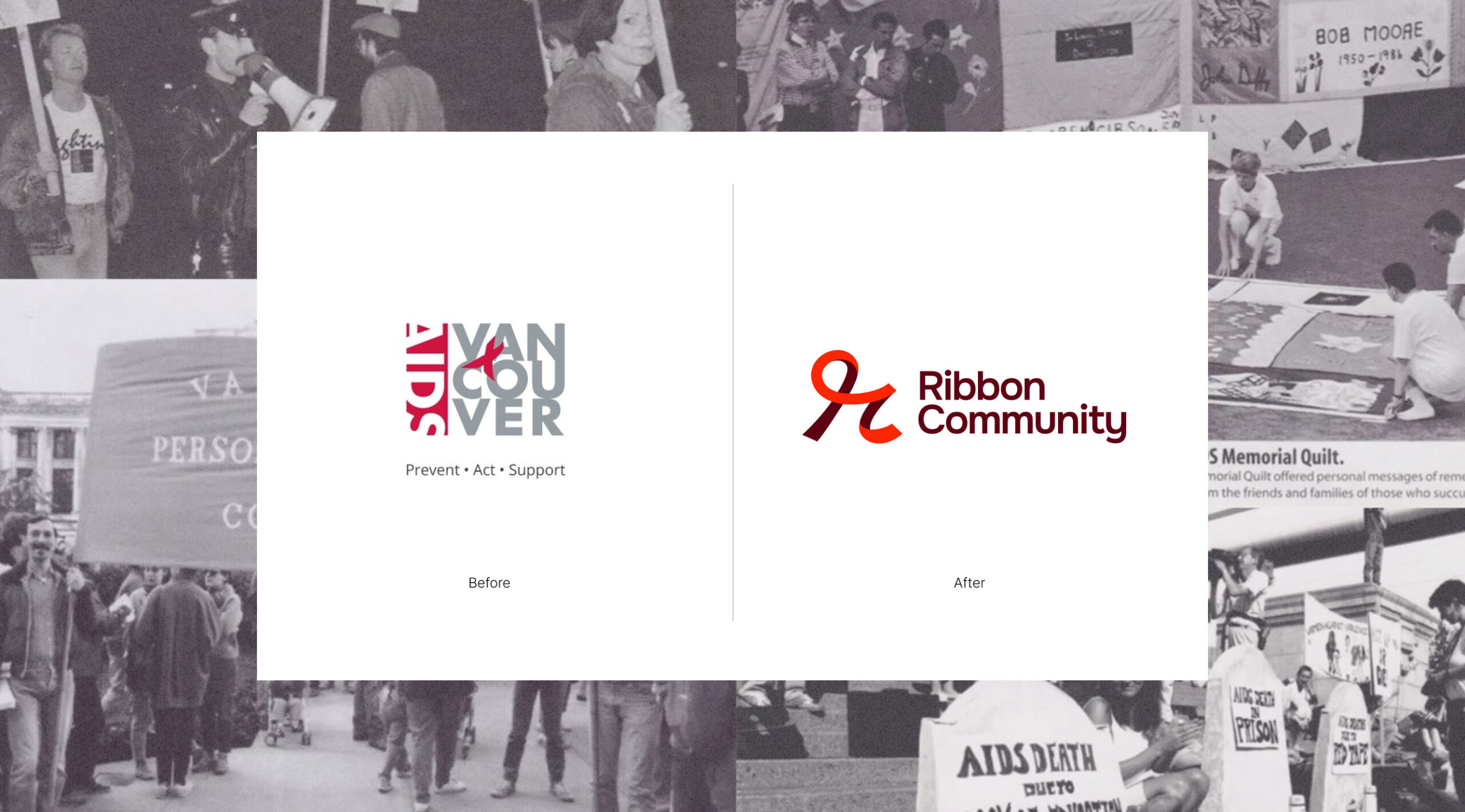
The decision to change the name was driven by two key factors: first, the organization works with communities beyond Vancouver and wanted to avoid excluding those outside the region. Secondly, and most importantly, the persistent stigma surrounding HIV/AIDS made the inclusion of ‘AIDS’ in the name uncomfortable for some audiences. However, HIV/AIDS remains at the core of their work, and a name must reflect what an organization stands for, whether overtly or subtly.
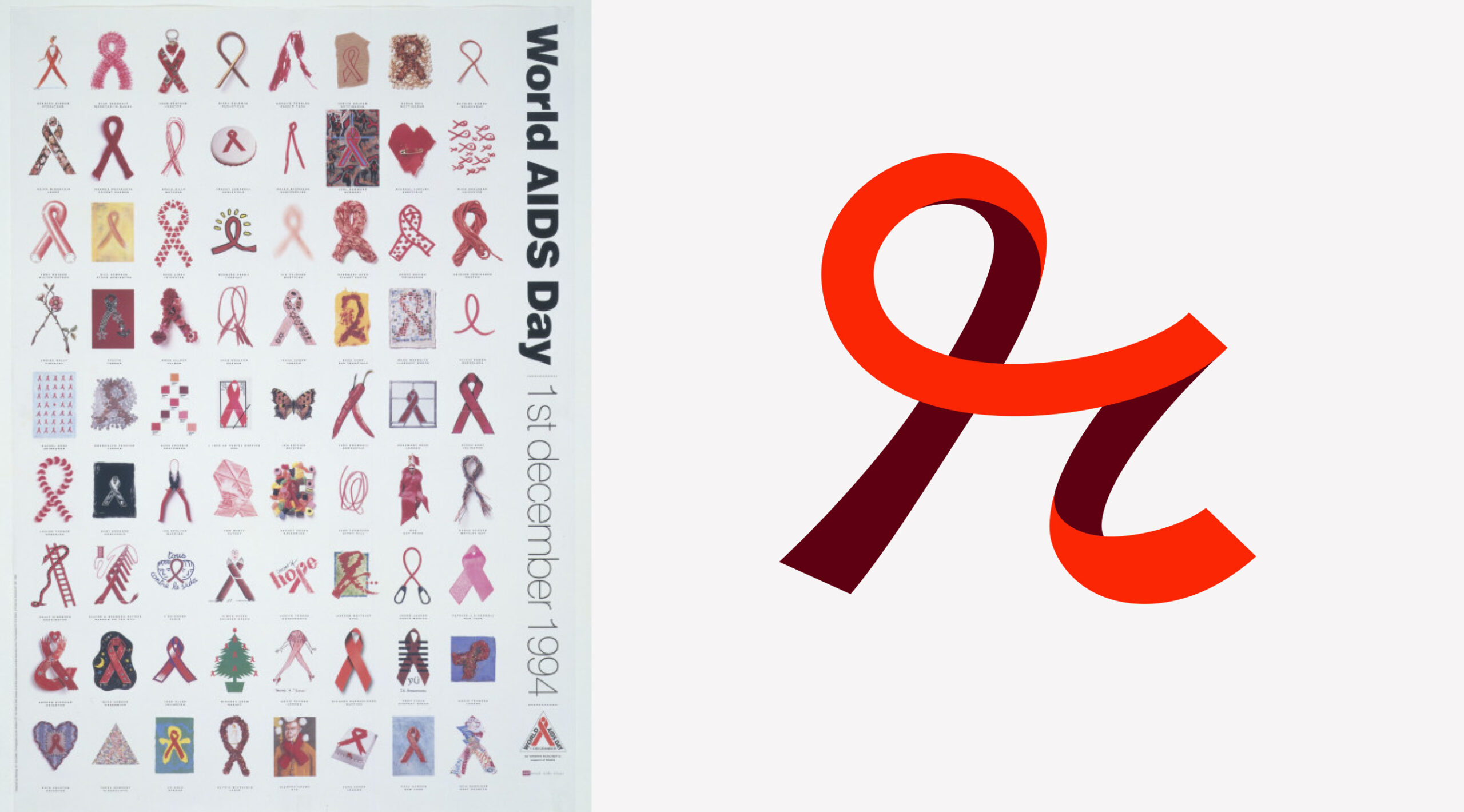
This insight, and a commitment to the past, present and future of the HIV response – led to the name ‘Ribbon.’ The red ribbon, a longstanding symbol of the AIDS movement, serves as both a subtle reference to the organization’s mission and a way to honour its proud history and connection to the movement.
A brand dedicated to ending stigma
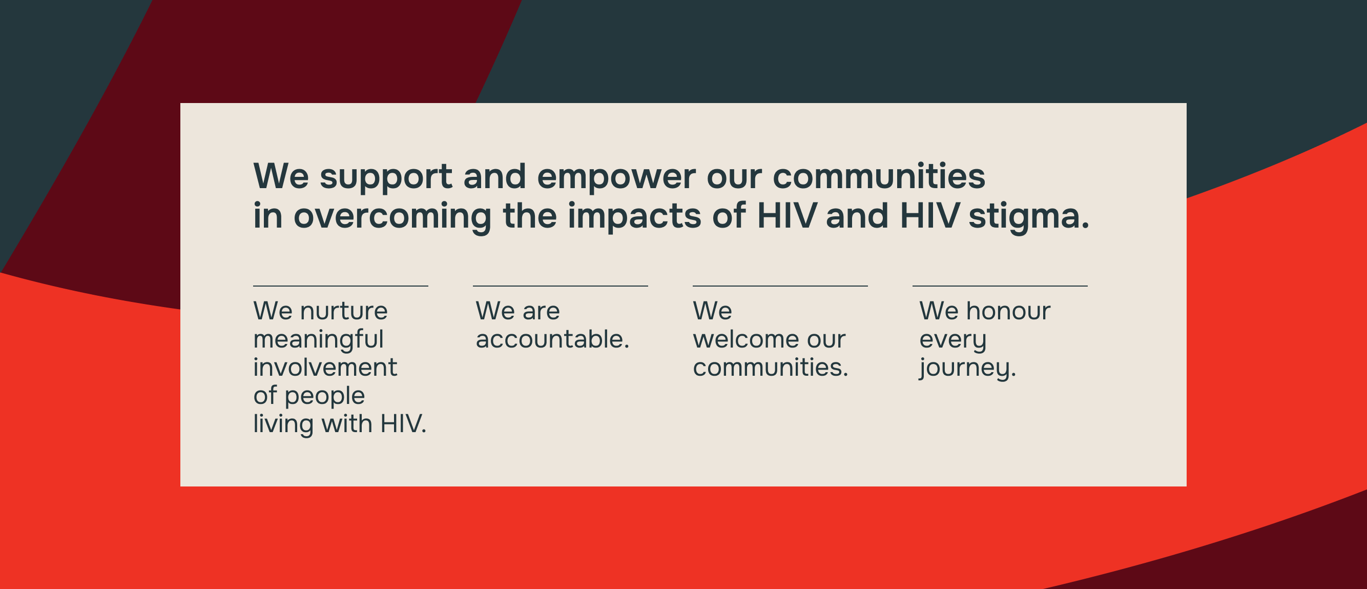
Our brand strategy built on Ribbon Community’s inclusive visioning process, which engaged over 100 people living with HIV and an Indigenous Committee. Through the Vision Our Future initiative, they asked a crucial question: how can we best support people living with HIV in 2023 and beyond? The responses, along with insights from Briteweb’s brand discovery workshop, highlighted a clear theme: overcoming stigma around HIV/AIDS. We collaborated with Ribbon Community to craft a purpose statement focused on eradicating that stigma.
Alongside their purpose and values, we worked with their team to develop a brand persona that reflects how the organization wants to be seen: respectful, trustworthy, approachable, caring, and empowering. This persona shapes everything from their colour palette to their tone of voice, which is reflected in the messaging below.
A Ribbon unlike the others
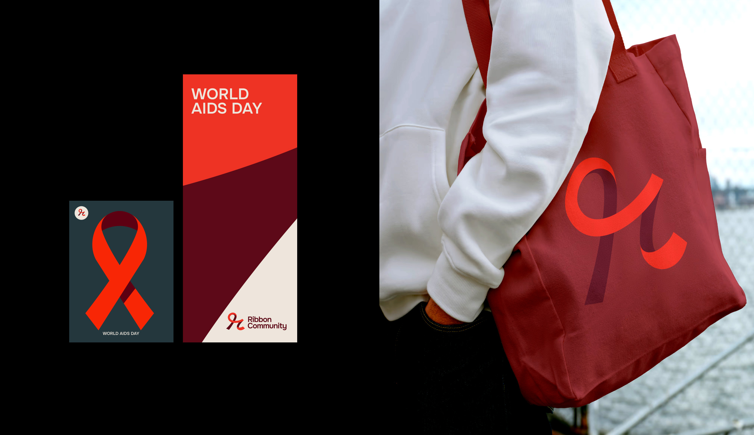
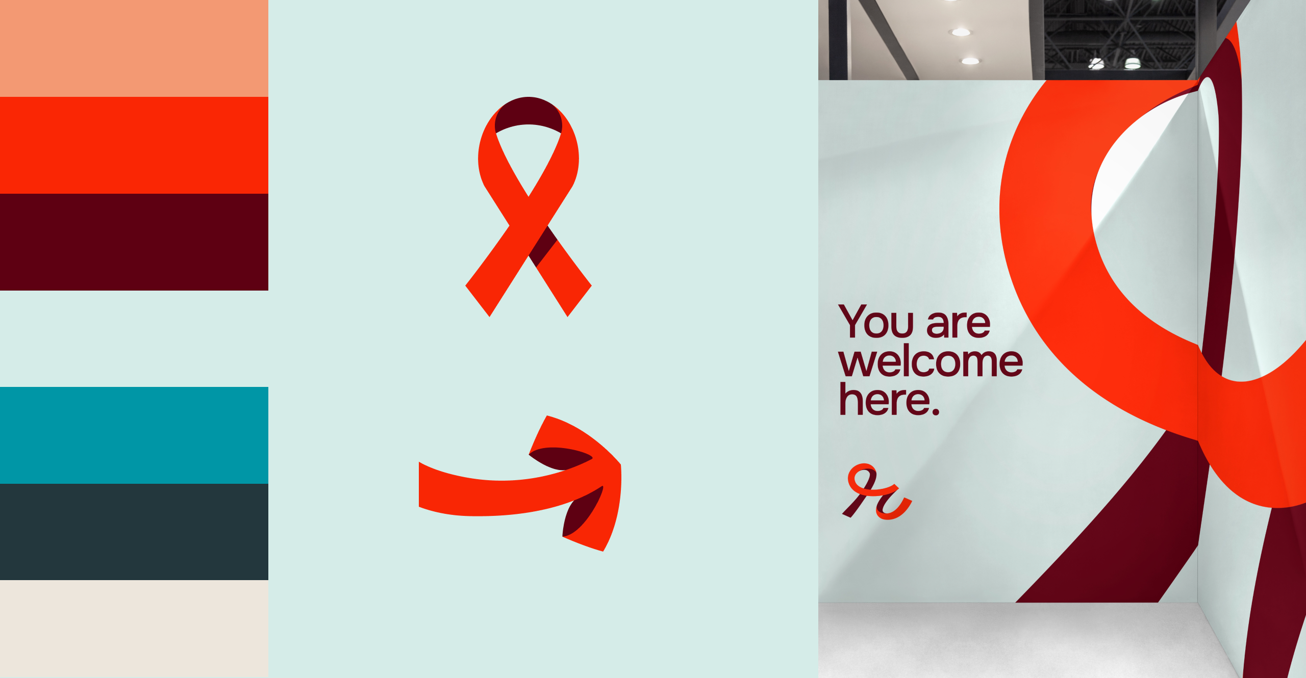
Ribbon Community’s new name allowed our design team to reimagine the iconic red ribbon symbol in a fresh way. The new Ribbon ‘R’ logo feels dynamic, and the various ribbon patterns, created by cropping portions of the logo, offer versatility. We made sure these cropped elements are easy to use, ensuring the brand remains consistent and impactful across all channels, from social media to event posters.
Our team also refreshed Ribbon Community’s colour story by complementing the traditional red palette with a secondary set of colours that better reflect the vibrancy and diversity of their communities.
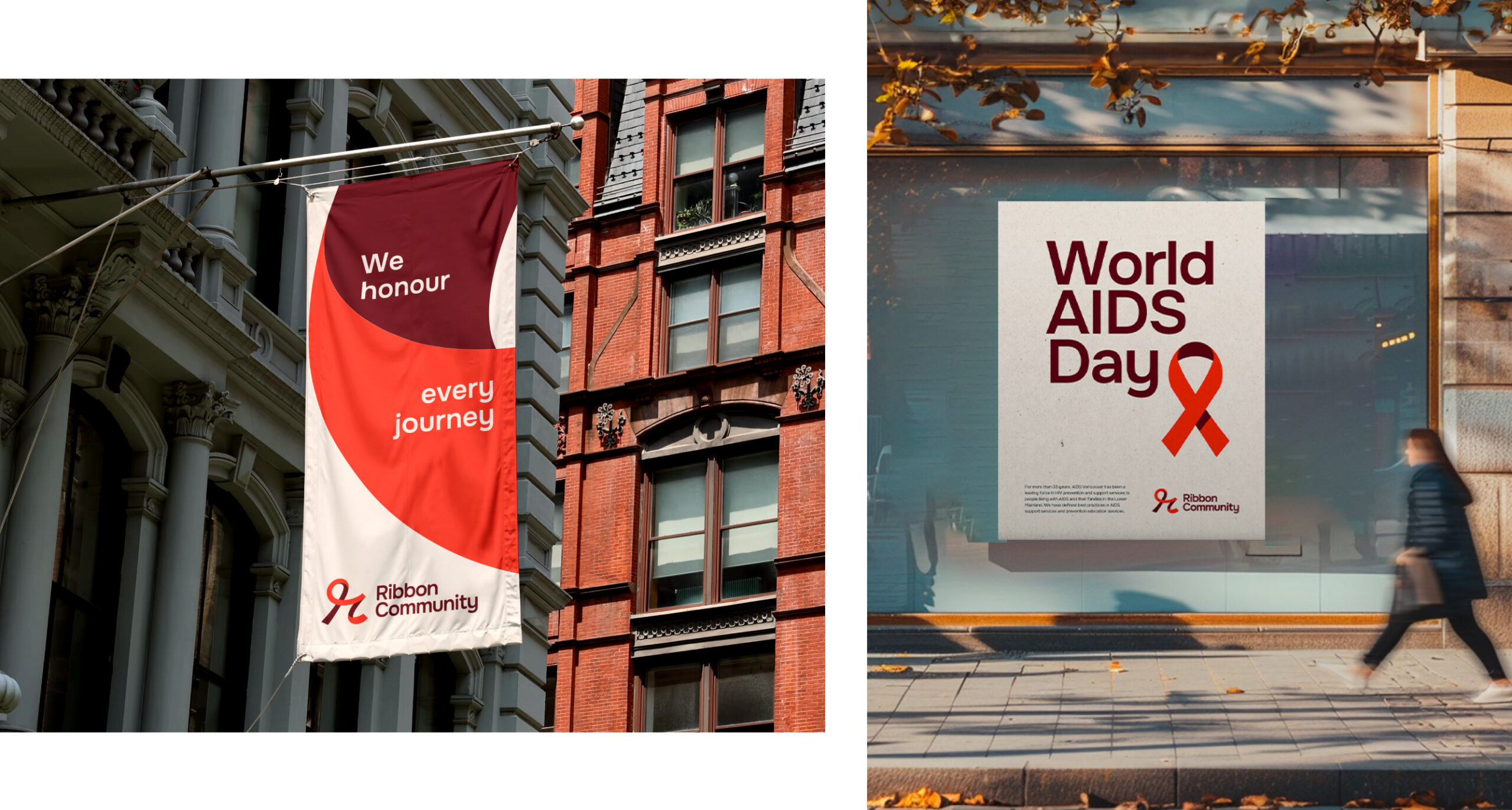
Welcoming spaces for diverse communities
Ribbon Community’s physical spaces have long honoured the challenges, victories, and resilience of the HIV/AIDS movement, resembling a museum that celebrates their community’s history.
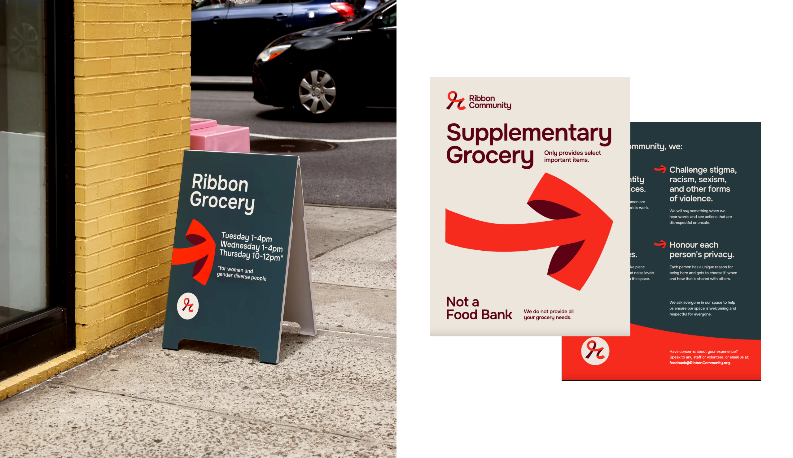
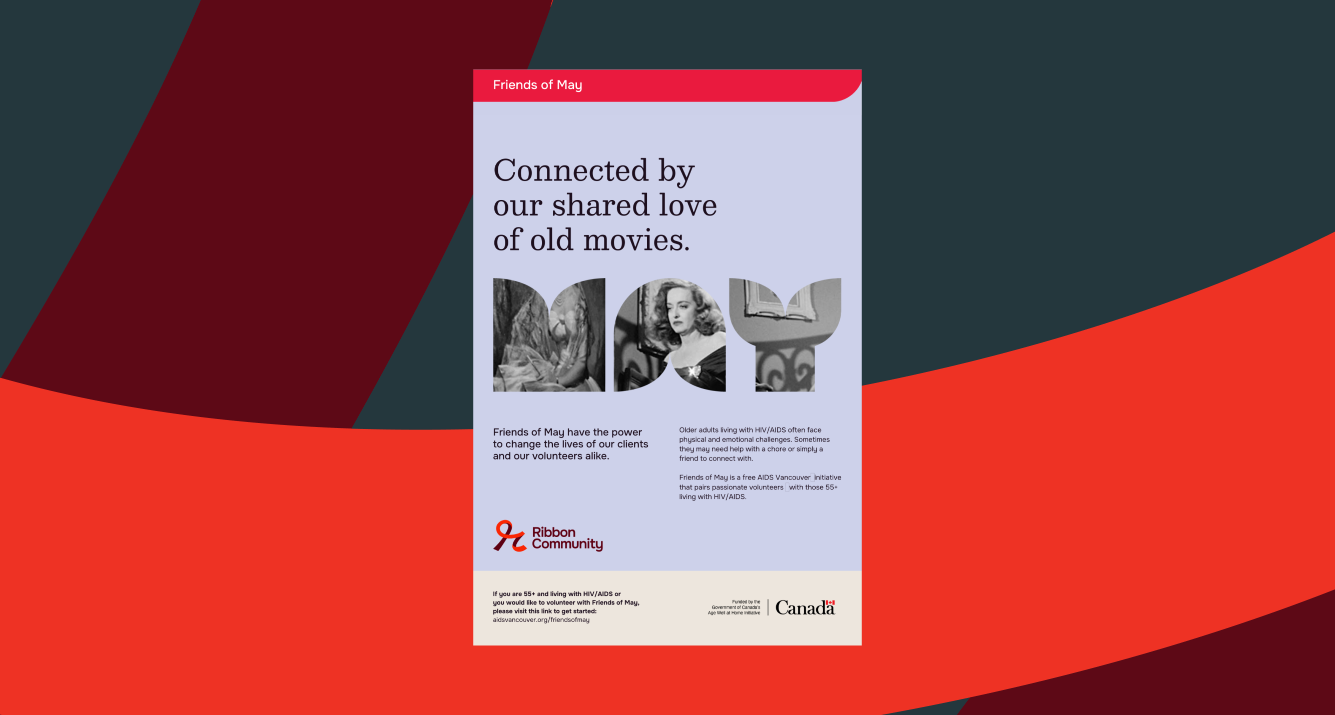
For us, it was essential to preserve these elements, while also adding cohesion and clarity where possible—such as with on-brand signage and posters that support wayfinding and community-building. For regularly used materials, like monthly event calendars, we created flexible templates that can be easily updated, printed, and displayed. The result is a space that feels right for their organization then and now.
Unveiling the new Ribbon
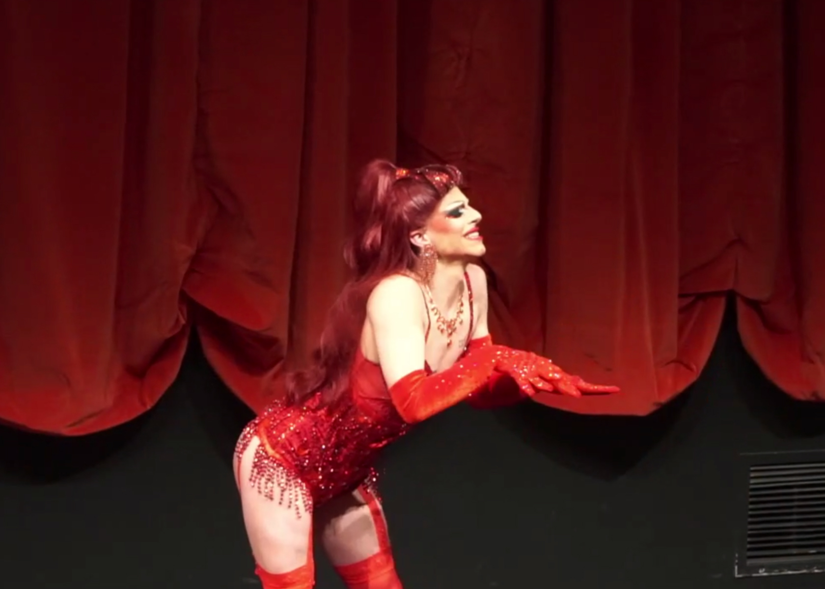
When it was time to unveil the new name and brand to Ribbon Community’s engaged communities, we were excited to support the team with guidance and collateral. For the intimate gathering, which featured everything from drag performances to board games, our creative team designed everything from banners to tablecloths to jigsaw puzzles. It was a beautiful culmination of months of thoughtful collaboration and creative work, and we were honoured to be there as the new Ribbon Community was introduced to the world.
