Accion Opportunity Fund
A new brand to uplift America’s small business owners.
Services
- Brand Architecture
- Brand Strategy and Messaging
- Content Strategy
- UX Research
- Website Design
- Brand Guidelines
- Branding
- Logos and Visual Identity Systems
- Web
- Website Development
The Challenge
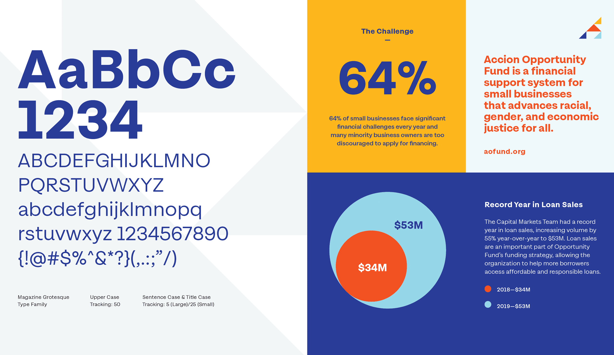
In 2020, Accion US Network and Opportunity Fund came together to become Accion Opportunity Fund (AOF), the largest nonprofit small business lender in the United States. Today, AOF serves as a financial support system for small businesses while advancing racial, gender, and economic justice for all.
The team from AOF approached Briteweb just as their two organizations were becoming one. They needed a new way to talk about their work as a unified front, an understanding of who they are and what they stand for, and a modern, responsive website.
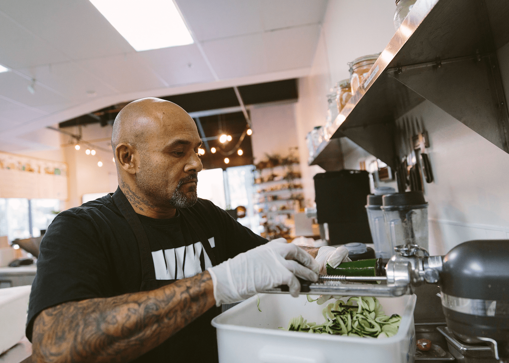
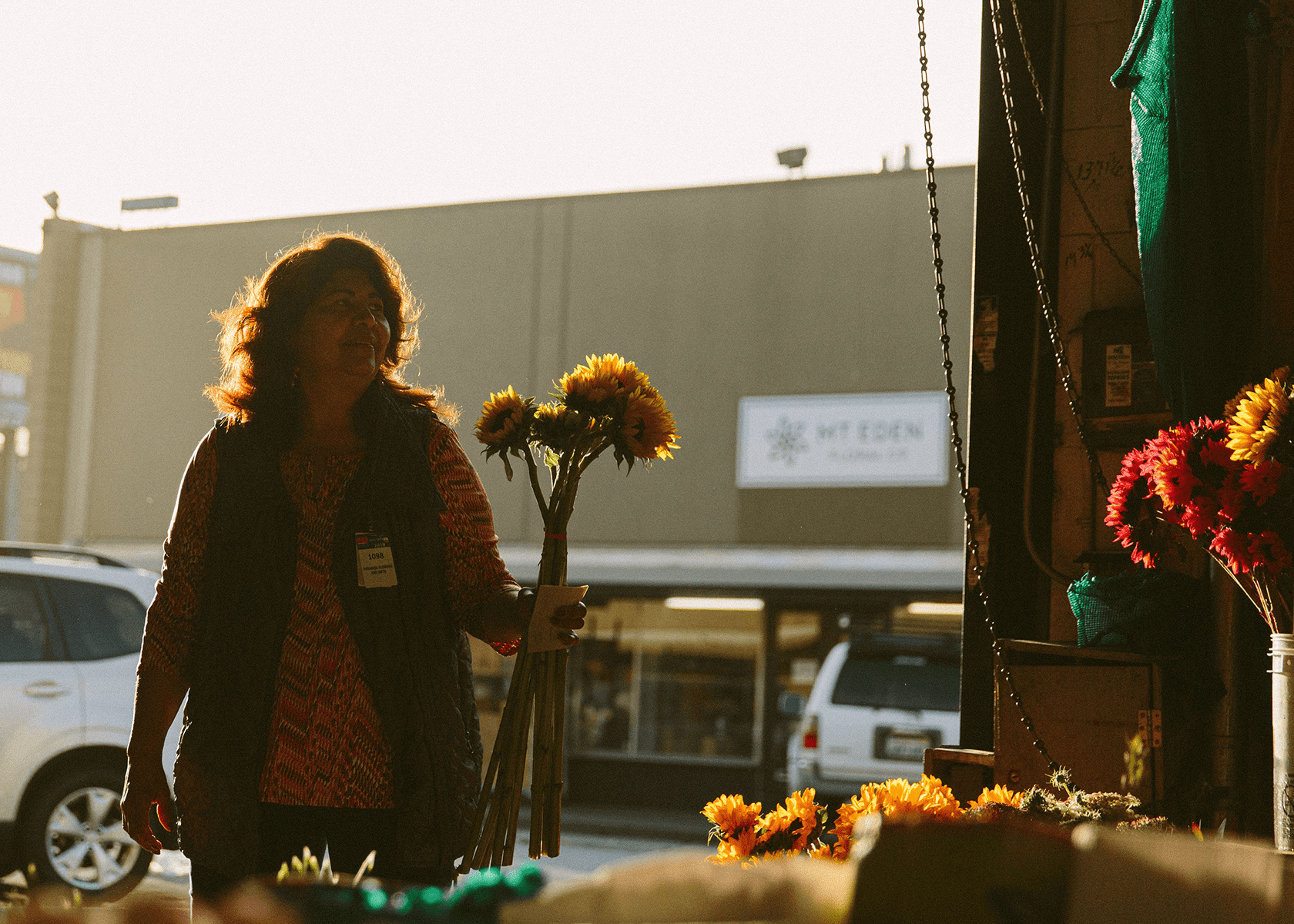
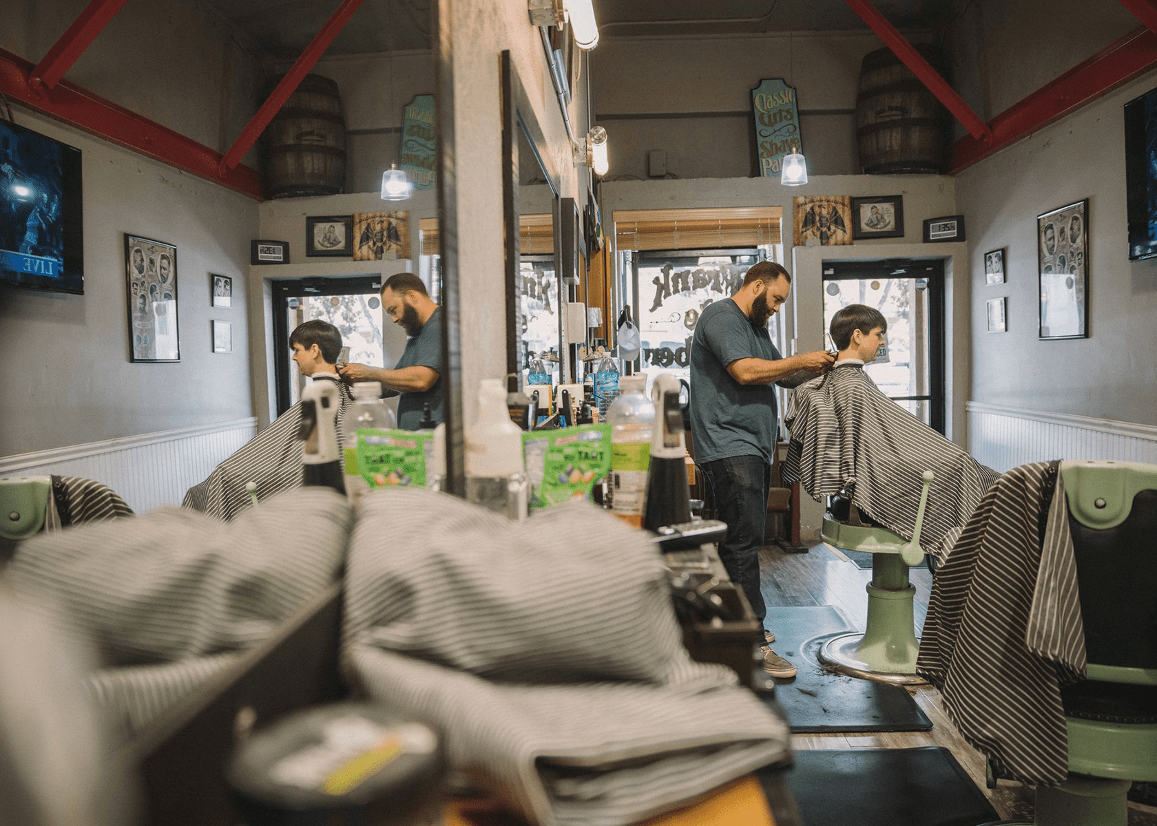
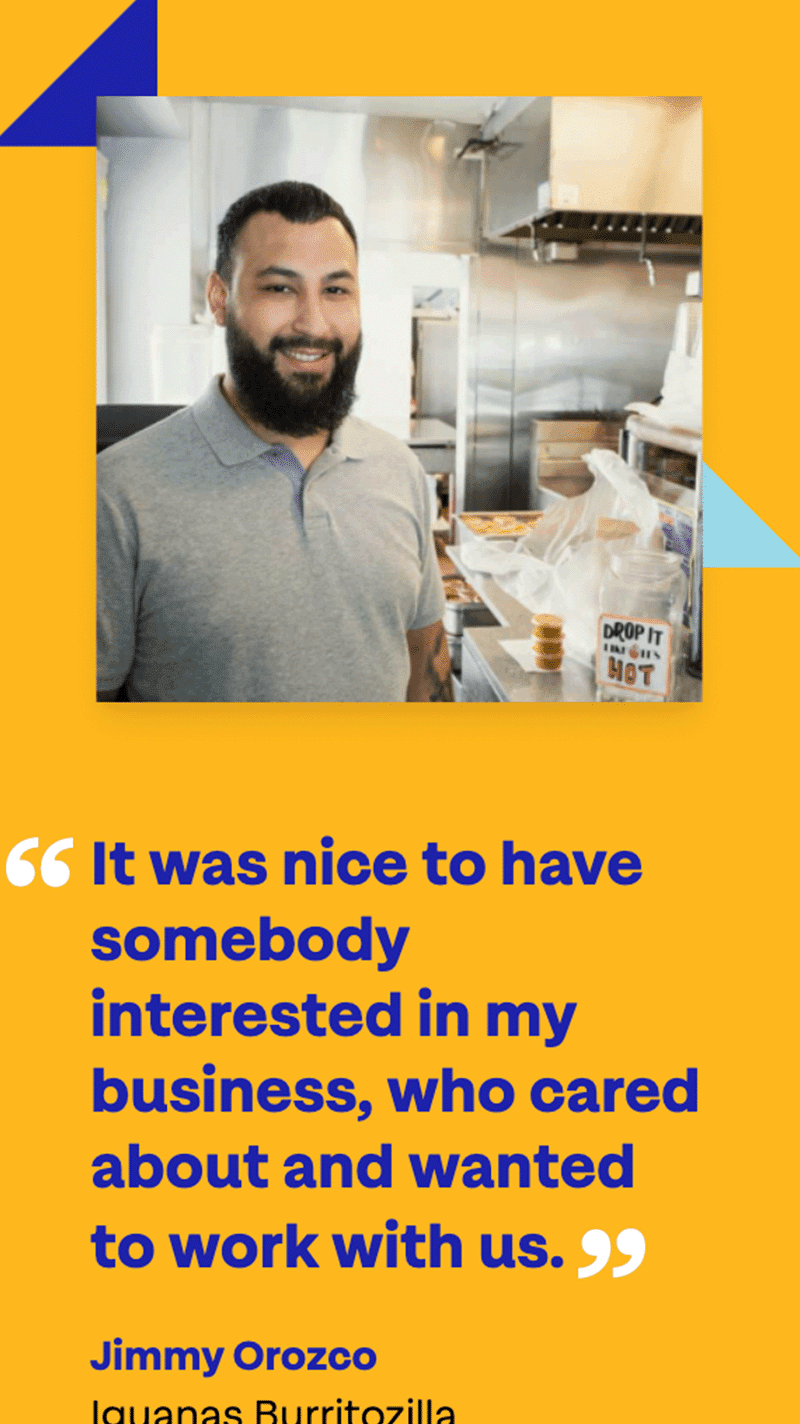
While AOF needed to communicate its own identity, it was also important to emphasize that the real protagonist was the AOF clients, America’s small business owners.
The Insight
As we approached the brand, we asked ourselves: how can we talk about who AOF is without decentering entrepreneurs?
That’s how we landed on the idea of AOF as the Sidekick. The Sidekick brand archetype represents an organization deeply committed to fighting for justice. One that doesn’t back down. But the Sidekick also knows it does its work to lift up someone else.
At first, there was some hesitancy in getting behind such a provocative idea, but we showed AOF how the idea originated amongst their own team, and how it was a natural extension of their values. The energy and excitement around the concept took off like a rocket.
The Solution
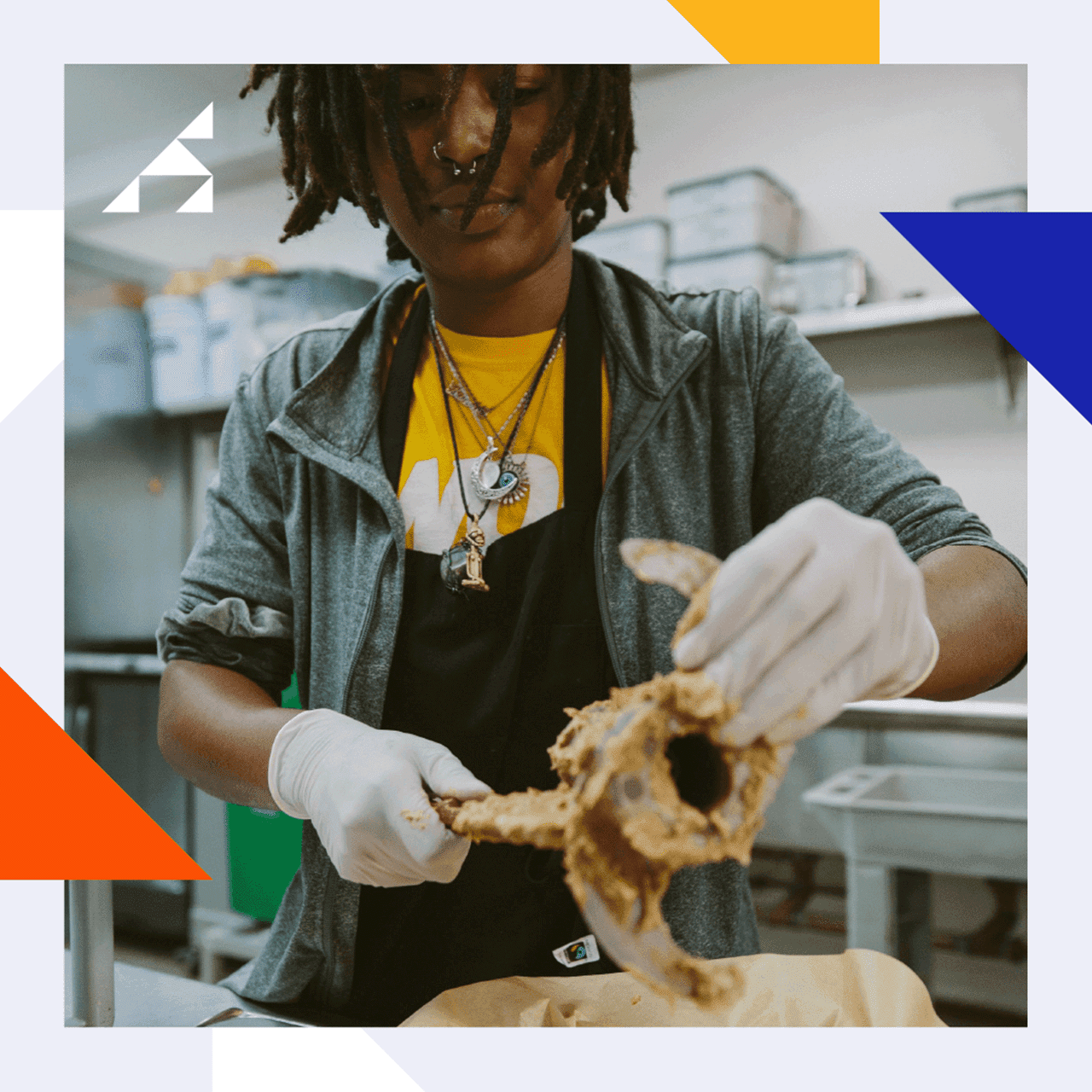
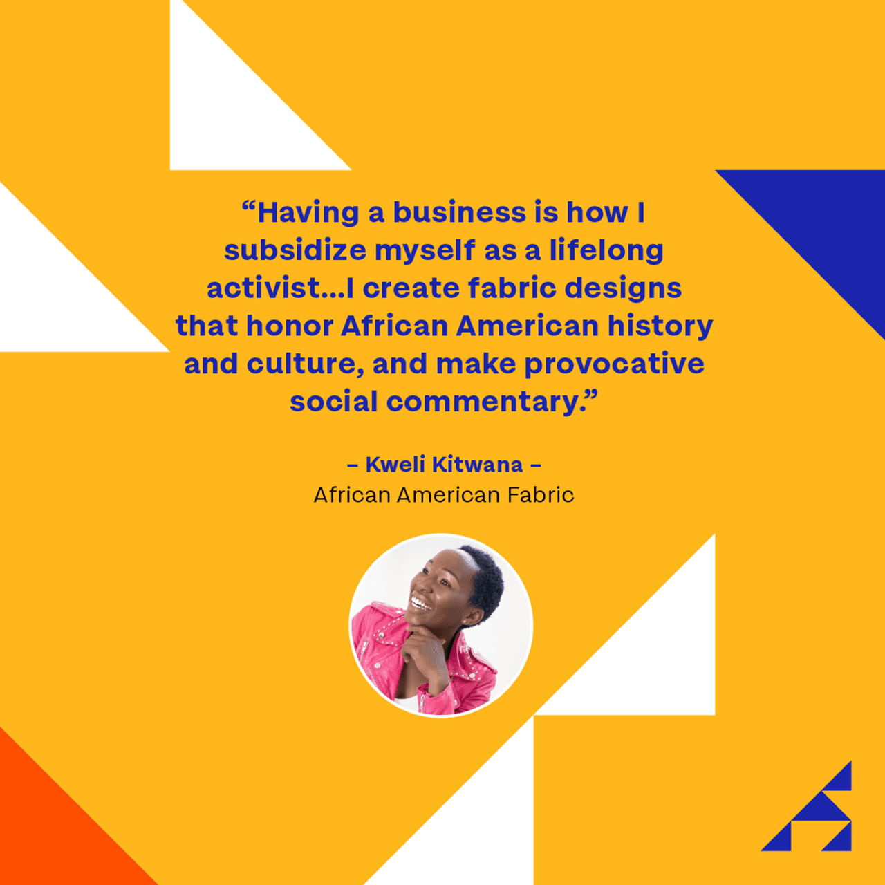
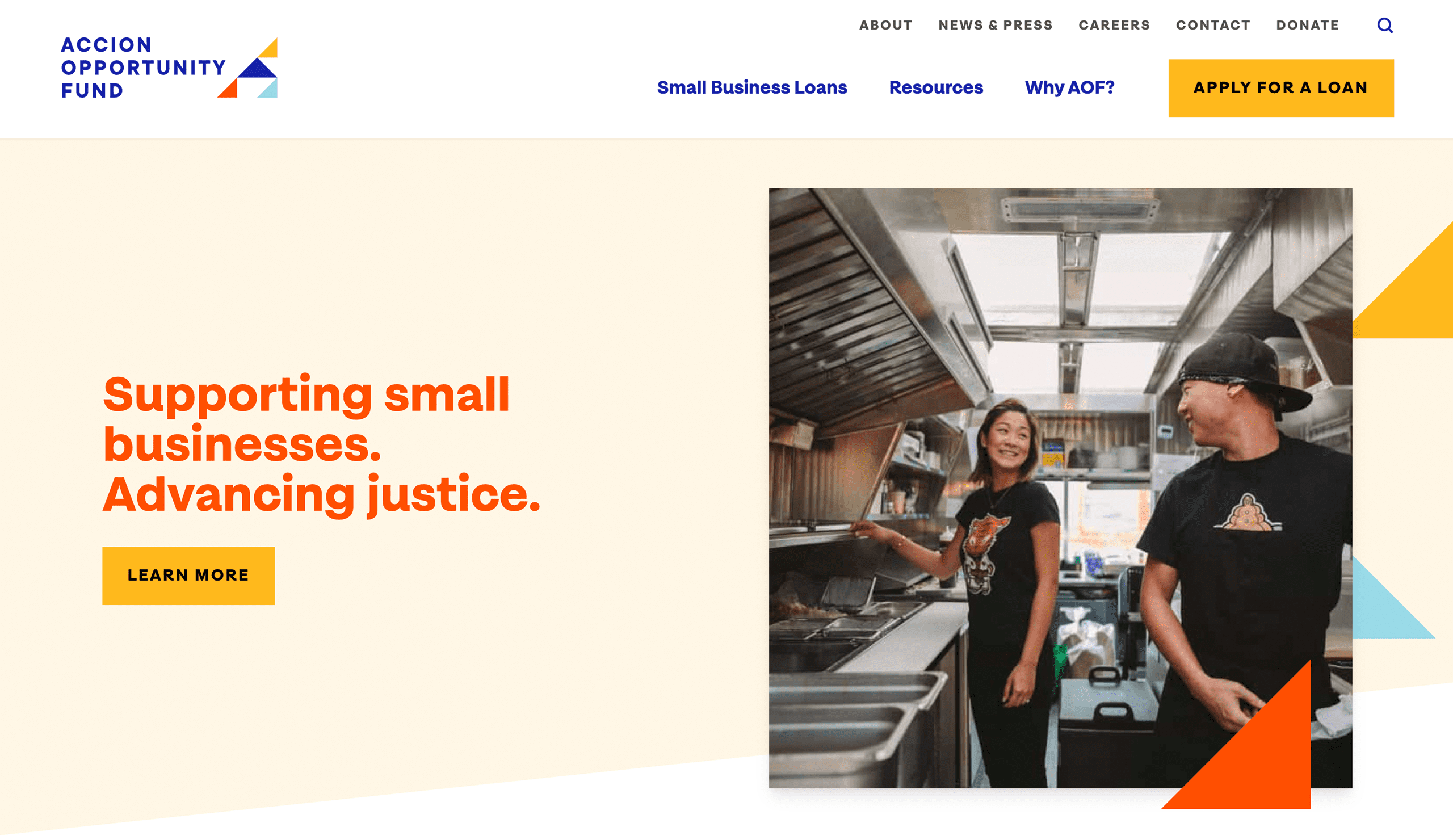
With the Sidekick in mind, we went about creating language and a visual identity that celebrates the clients of AOF. The first step was designing a dynamic logo that speaks to transformation, growth, optimism, and diversity. The logo helped inspire the visual identity of the website, which showcases imagery celebrating the heroism of small business entrepreneurs.
Focusing on the client also meant making sure the website was accessible, and building as much transparency as possible around the loan process up front. The strong brand provided clear direction to every other piece of the project –– from design, to copy, to web.
They are quick thinkers and great listeners and loaded with talent. Everyone from project manager, to strategist, to designers and coders, took the work seriously [and] delivered results that delighted our team.
