Popular documentaries like The Social Dilemma have opened our eyes to the reality of digital data collection. With so much of our lives being digitized, we often don’t realize what it really means to be giving up personal data on the web. We upload and input tons of information to the web every single day and we could be allowing companies to use that information freely without even realizing it.
We all know about the importance of consent in our daily lives — we practice it daily and we teach it to our children — and in our digital lives, we also have a right to consent, to the collection, storage, and use of our data.
So what does this matter to you and your organization? Implementing data protection and consent-based web design is not only the ethical thing to do, but it also helps build trust between your organization and your website visitors. To us, it’s a key principle of every successful website.
What is consentful design?
The basis of consentful design is ensuring that:
Any intention to use or distribute your personal information is clear to the user before proceeding and,
that the user has the option to stop sharing their information at any point if they don’t want their data to be used.
Have you ever clicked agree to terms without reading the terms? Or maybe you choose to skip over the terms and conditions because they’re convoluted and confusing. Consentful design is about more than just giving users an option to opt-out.
Designing for consent is about making sure users are completely aware of the information they’re sharing and how it’ll be used in the present or future.
It’s also about making sure that they understand their options. For example, oftentimes it’s not clear how to enter a site without accepting cookies.

What are the basics of consent-based design?
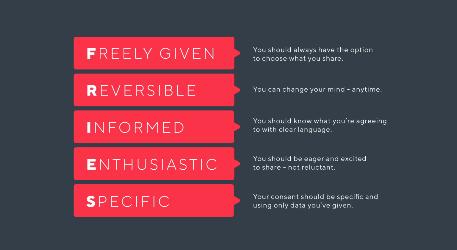
The basics of consentful design can be summed up by the acronym FRIES and originates from sexual consent. It might seem like they have nothing in common, but the basic principles of consent are always the same, no matter what topic we’re discussing.
Freely Given: Any information given online should be given without any pressure or manipulation. Every user should feel as though they have a choice when it comes to what they choose to share.
Reversible: Consent can always be taken back at any time and for any reason. Users should be able to change their mind at any point of the online journey.
Informed: Everyone has the right to know what they’re accepted to before they agree to anything. Consentful design includes clear language that accurately informs the user about how their data is used.
Enthusiastic: Attitude is an important factor in consent. Web users should be eager and excited to share any piece of personal information. If there is reluctance, it isn’t really consent.
Specific: Consent always has to be specific. If a user agrees to one thing, that does not mean they agree to it all. Consentful sites will only use data specifically given by the user, not more.

What does it look like to design with consent?
Consentful design will always be clear and transparent. The user will always know exactly what data is being collected and have the opportunity to reverse their consent if they no longer want to share that information. Here are some common places on a website that might indicate if they’re respecting the user’s rights and privacy.
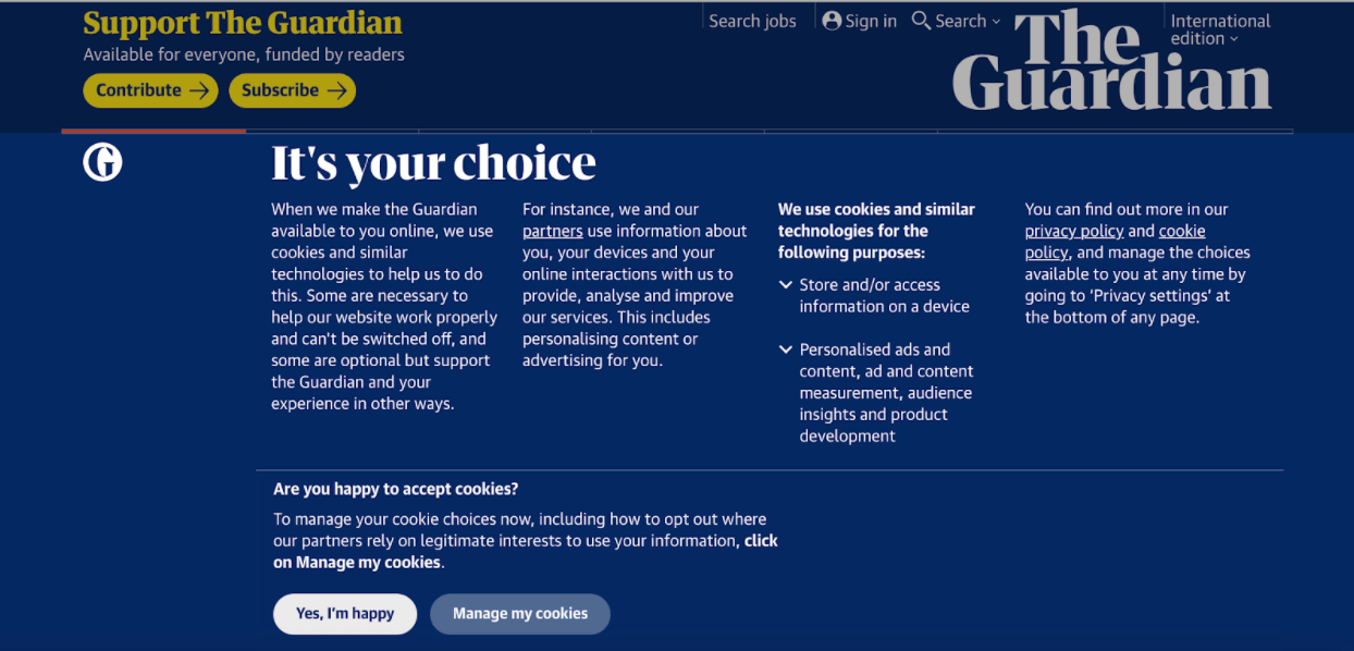
Cookies: There should always be a choice when it comes to cookies. If the user has to accept cookies to enter a site that’s “a false choice,” says Harano because there’s no alternative option.
Forms: When sites are collecting email for newsletter subscriptions, it’s best practice to have a line above explaining how the organization will store or use the information as well as how they can unsubscribe.
Terms & Conditions: It’s important to consider the language being used here and to be as clear as possible in explaining what it is the user is agreeing to.
Footer Notes: Any other information users might need to know should be included in the footer notes. This can include information about Google Analytics usage, data usage, or anything else along those lines.
Problems with unconsented design
Unfortunately, unconsented design has become the norm. We’re so used to large companies taking our data under false pretenses or using it in ways they’re not fully transparent about. Consentful design is a response to these issues. It’s a way to make the power distribution more even between people and companies that collect this data.
There is also a racial justice aspect to the matter. The impact of unconsented design disproportionately impacts minority communities. For example, surveillance tech may be used to police or misidentify minority groups. The types of companies that use this personal data are also the companies we rely on every day for work and personal matters. The bind we’re in right now as a community is that we don’t have a lot of alternatives to these types of sites yet which we use in our work and personal lives every single day.
There are also legal ramifications that come with unconsented design. Canada’s Anti-Spam Law (CASL) protects users’ rights by making sure every site has a clear opt-out feature for any forms of communication. It also protects users by stressing the need for opt-in features, which Canada’s government describes as “express consent” (as opposed to implied consent). This means that the user has to give explicit permission for the organization to use their email or phone number to communicate with them. The laws are similar in the EU. However, there is a term called “soft opt-in” which allows organizations to evade explicit consent from people who have bought something from them.
The US is one of the only countries where you do not need consent. The CAN-SPAM Act focuses more on opt-out capabilities and less on providing consent beforehand.
How to ensure your organization is doing it right
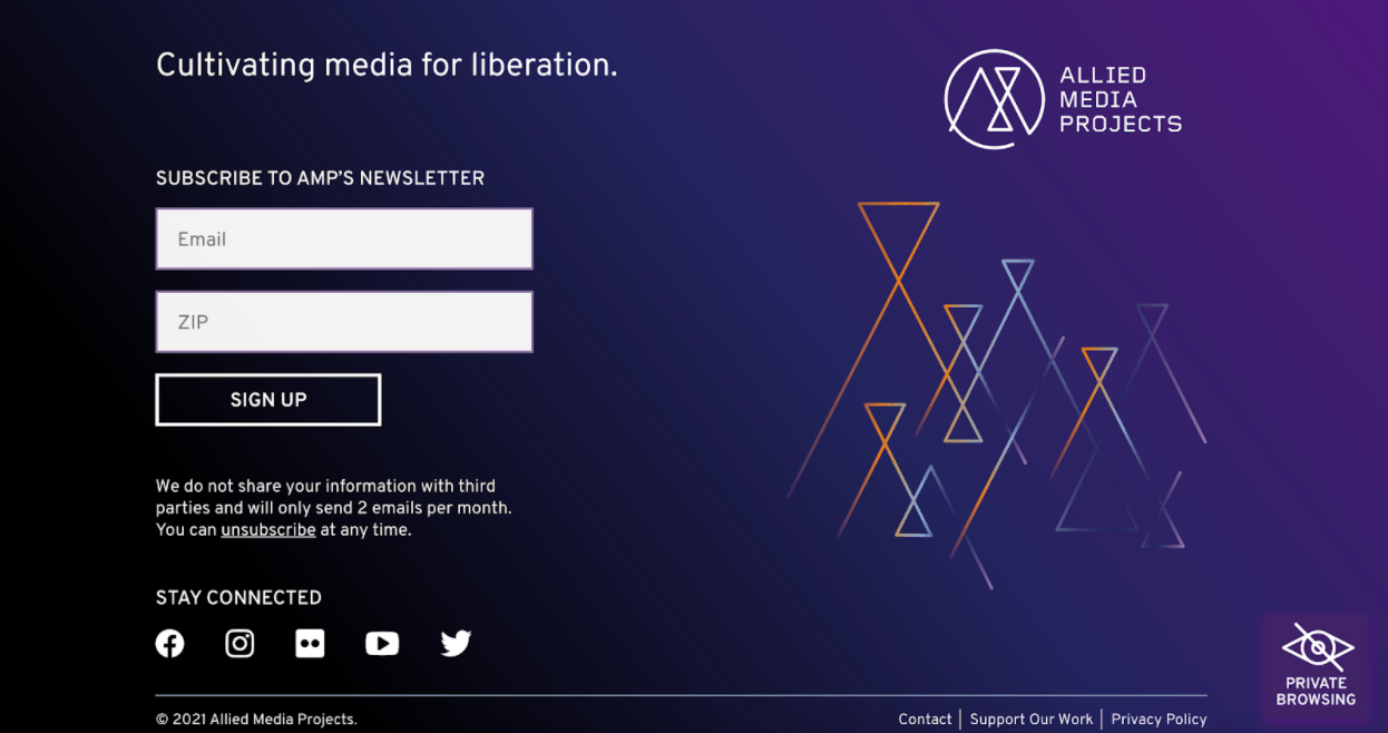
The good news is, there are some good role models out there. We look to Allied Media Project as an example. It is an organization that hosts conferences and sponsors some great projects all centered around consent-based tech. And they don’t just talk the talk. Allied Media Project is a fantastic example of what consentful tech actually looks like.
Upon entering the site you can find more information on their “private browsing” feature as well as a brief blurb under their subscription field that reads:
We do not share your information with third parties and will only send 2 emails per month. You can unsubscribe at any time.
Not only are users able to opt-in to the newsletter, but they also know exactly how to opt-out.

Source: alliedmedia.org
Opting-in is a great way to give people power over their own data. The Guardian does a great job at helping users understand what cookies are and letting them manage their cookies before entering the website.
A checklist to make sure you’re creating a consent-based website:
- Do an audit of your website applying the FRIES analogy
- Make an inventory of the forms on your website that collect data
- Analyze your cookies — is there a real option to opt-out?
- Check your website’s footer for any disclosures your visitors should know about
- Work with your team to develop or update your site to be more transparent
If you’re curious to learn more about consentful design and how Briteweb’s UX design team approaches this for the websites we build for our clients, give us a shout.
