When it comes to mastering your organization’s online presence, there’s a lot of work that goes into the creation and upkeep of a website or app. It’s not just a one-time project, it’s an ongoing task that requires constant upkeep. Design systems provide the behind-the-scenes structure that set your organization up for success. They’re essential in order to have a consistent brand identity and user experience that can transition efficiently from one phase to the next.
To fully understand design systems and their purpose, let’s start from the beginning. Keep reading to learn everything you need to know: what they are, why we need them, and how to go about creating them.
What is a design system?
A design system is a source of truth for your organization — a one-stop-shop for everything you’ll ever need to know about the brand. This includes overarching truths like the mission statement and core values, but it also includes the nitty-gritty details like what a button on a website will look like, how it should work, and little snippets of code.
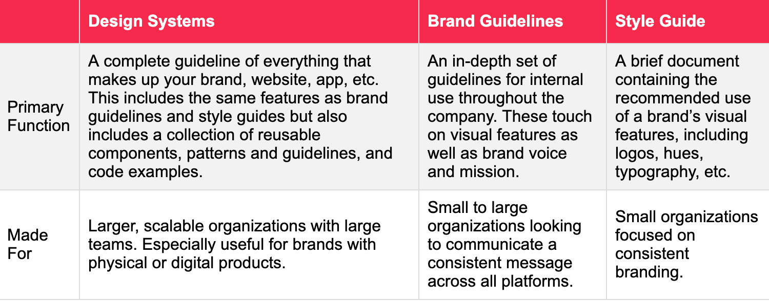
“It’s a style guide on steroids,” our Senior UX & Product Designer Michael Hagel says. Think about all of the features that go into a traditional style guide: colors, fonts, photography styles, visual language, logo, etc., and then add all of your UX patterns and UI components with clear standards of where and when to use them. That’s a design system. For example, if you decide one day to create a blog feature for your organization, you should be able to refer back to one living entity that will provide a guideline of everything you’ll need to set up the landing page, including the exact code you need build out the individual elements — such as a “read more” button.

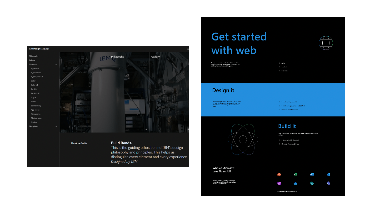
Design system examples
Why are design systems important?
There are a few reasons why a design system is essential for your organization. The first is consistency. As every branding specialist knows, the key to gaining trust among customers and clients is consistency. People want to know they can rely on your product or service time and time again. While a design system might not directly impact the work your organization does, it does affect the experience your users have. Without a design system, you run the risk of having inconsistent UI elements, code and confusing back-ends. And with today’s web-centric world, there’s no quicker way to lose a potential supporter, client, or customer than with a faulty website.
Another benefit of design systems is that they allow for smoother transitions between designers and developers. Team members come and go throughout the lifetime of your company, and there’s always something that gets lost in the handover. A design system ensures that your website and brand will remain unchanged even during staff turnovers. Additionally, it will allow you to source other experts to help with design and maintenance without having to refer back to the original creators of your site to ask which elements are correct.
A third benefit of design systems is efficiency. With a design system in place, developers can build and ship faster, which saves your organization time and resources. They also bridge the gap between UX designer and UI developer, so building a website or digital product is more seamless when it comes to communications and workflow. Every project is easier when there’s a roadmap, and you can think of a design system as a roadmap for your organization.

Left: IBM Design System. Right: Microsoft Design System.
Does my organization need a design system?
An organization that sells any type of product could definitely benefit from a design system. It puts you in a better place for the future and will allow you to focus on your growth. If you’re a small company, it might seem presumptuous to build a whole design system, but the truth is, it will only save you time down the line. Design systems are an investment in the future of the company, your products, and your services. If you lay the groundwork when you’re just starting out, it will save you the trouble of having to backtrack later to sort out inconsistencies.
Any brand that cares about creating a consistent experience across multiple touchpoints should be investing in a design system,” says Hagel. It might not be for every single company, organization, or brand, but it is certainly an asset for those striving for stability.
How to approach my design system
The first step is to decide whether to use in-house designers or hire a digital agency to create your design system. Even though you might not be the one designing the system, it’s still a good idea to understand how and why it’s built the way it is.
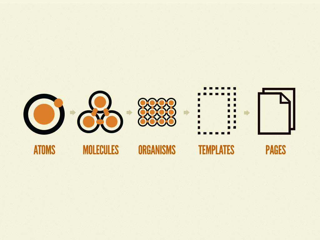
One of the most popular ways of thinking about and structuring a design system is based around the Atomic Design methodology. Invented by Brad Frost, Atomic Design is a systemic approach with five levels that are based on chemistry. Frost realized that if everything in the world can be broken down into atoms, the same should be true for design systems. With this methodology, you would be able to break down each element of your brand into fundamental building blocks.
The five levels of atomic design:
-
1
Atoms
These are the individual elements, like text, icons, and small pieces of HTML. Nailing down these minuscule parts is essential for building a functional design system.
-
2
Molecules
A molecule is how those atoms come together to create features you can actually use on a site, such as a search bar, which is a combination of a few basic elements: icon, text field, and a label. Separately, they can’t do much but together, it’s essential for any web page.
-
3
Organisms
An organism is a collection of molecules that start to show the actual interface of the project. This could be a website masthead, footer, or product grid.
-
4
Templates
This is the point where it will probably start to get more interesting for the client. You can finally see the pages start to come together by grouping organisms.
-
5
Pages
When you start inputting specific information into those templates, that’s a page. This is where you can see if your design system is actually effective. With a design system that lives on the web, you can modify any of the previous levels and subsequently update the site in an organized manner.

Graphic courtesy of: bradfrost.com
So, how do you know if Atomic Design is the right approach for you? If you have many components to your site, this could be a good choice. It keeps everything organized and is also a widely known concept, which can come in handy if you’re ever handing a web project over to an agency and onboarding a new UX designer.
If you have a smaller site, Atomic Design might be too complicated for your project. Other ways to organize your design system architecture include by purpose, by object, and by alphabet.
How to build a design system
-
1
Audit
Much like with any project, The first step is to take inventory of all the assets and UI elements across all the different properties within your brand. That includes websites, web apps, mobile applications, presentations, and more.
-
2
Finalize
Once you’ve done that audit, you can decide which features are going to make it to the final version. Before creating a design system, you might have 10 different types of buttons floating around. This step is in place to narrow down your elements and create a sense of consistency. You might also realize through the audit that you’re missing some elements, in which case you’ll need to start from scratch and design anything that’s missing.
-
3
Loop in developers
Now it’s time to get the engineering or development team on board with creating all of these elements. This is where the documentation takes place. It’s important not only to note which elements you choose but also why. A great design system will include explanations for each decision. Why would you use button A over button B? This helps others understand why the system is the way it is and prevents people from retrying iterations that were already cut from the system.
-
4
Put it in a central location
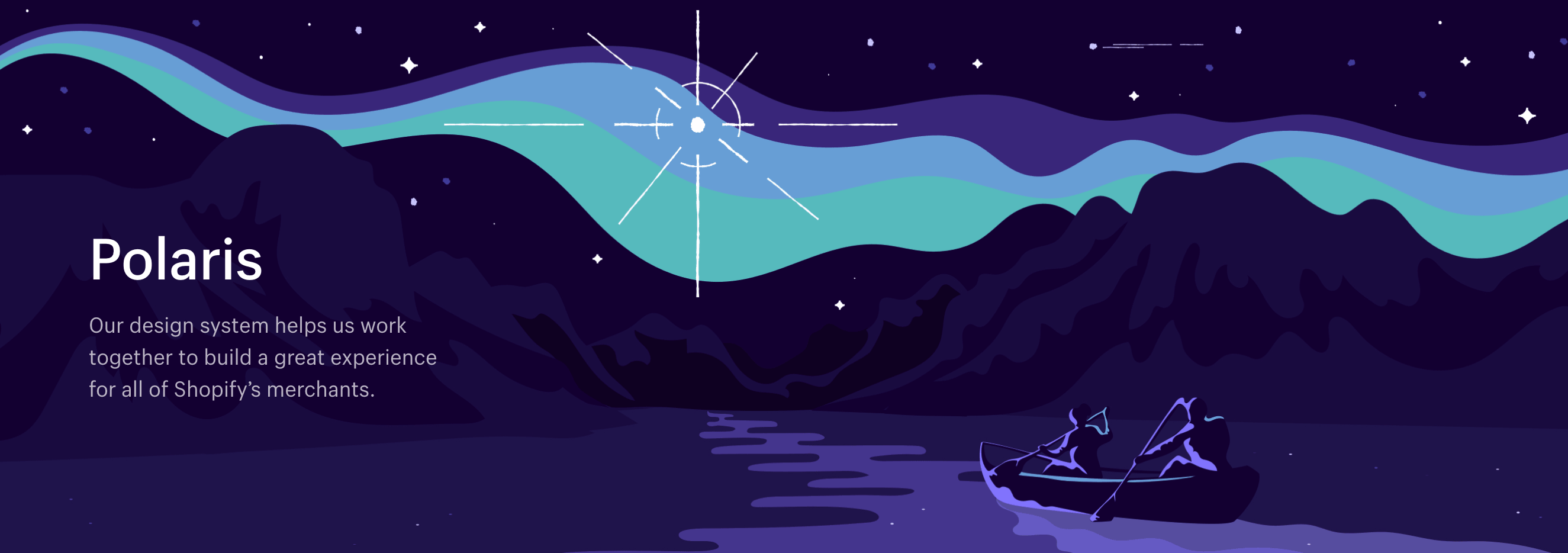
A design system is only useful if the right people have access to it. Many big companies choose to make their design systems public so everyone who needs them or wants them can take a look. For example, Shopify’s design system Polaris is available online with every single detail a designer, copywriter, or developer might need to stay on brand. This includes components such as sounds, spacing, feedback indicators, and forms.
-
5
Keep updating
Don’t forget to designate a person or department to oversee the design system. It should be clear to everyone on the team who’s responsible for updating the design system and making sure everything is in order. Remember: it’s not a PDF or a print out. A design system is a continuous product, not a one-time project.

Polaris Design System
A design system isn’t just a nice-to-have feature, it’s the ultimate source of truth for your entire brand. Just imagine what it would be like to communicate with your peers without the dictionary. If we all had our own ideas about how to spell each word, we wouldn’t get very far. The same is true for design systems. If everyone in the organization has a different idea of how key components should look and operate, you would never successfully grow.
While there is a very clear design system definition, there’s no one right to make one. If you’re not sure if your organization needs a design system or don’t know where to start, reach out to us. Our expert team of designers is here to help.
