
Insights
How to Choose ADA Compliant Colors
These days, providing accessible experiences on your website is not just a best practice: it’s the right practice.
There are a number of factors that come into play when we start talking about ADA (American Disabilities Act) website compliance.
Navigation, sound, and time-constrained features are just a few examples of common barriers people with disabilities face when making their way through non-ADA compliant websites. If you’re wondering what ADA compliance is or how to follow color accessibility guidelines, you’ve come to the right place.
This is the beginning of our deep dive series, where we’ll be breaking down and exploring the different aspects of ADA website compliance to help your organization understand and implement these important aspects.
What is ADA website compliance?
To make the web accessible, it is the responsibility of each individual organization, company, and business to make sure their site continually meets specific compliance criteria. There are guidelines for different places in the world, with regionalized resources readily accessible online to determine the exact guidelines most relevant for your organization. WCAG (Web Content Accessibility Guidelines) are the standards most people use as a reference for ADA compliance.
Choosing a colour palette for your website
Within the territory of visual aspects, there are many components to consider in order to make your web design accessible. Think about everything you see on a web page that gives you context or information: text, images, and color. If those components aren’t chosen mindfully, they can be extremely challenging, or even impossible, to decipher by users who are visually impaired.
Specifically speaking about color palettes, ADA compliance means that colors on a website are chosen in a way that’s easily read and understood by everyone. When choosing a color palette for your site, you’ll want to consider the following:
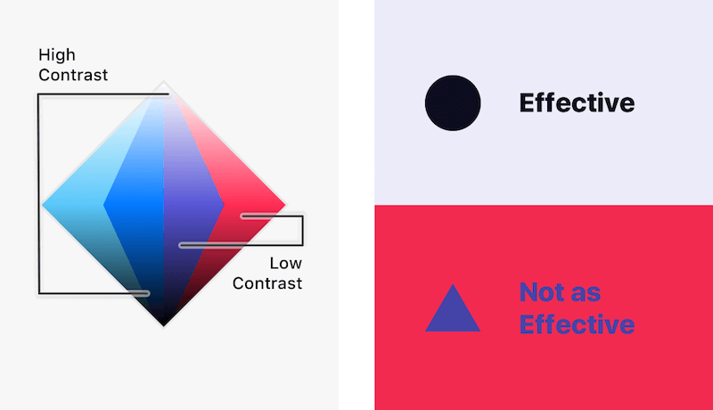
Diagram courtesy of Smashing Magazine.
When we started working with The Chicago Lighthouse in 2018, it was clear their logo needed a refresh. The organization serves the blind, yet the old logo wasn’t optimized for users with color vision deficiency. We simplified the lighthouse icon and designed the new logo with two high-contrast shades, navy and orange, which helped increase visibility.
The new Chicago Lighthouse logo
Use a color checker
There are different ratings within WCAG, but to meet AAA standards (the highest level) the contrast level must be 7:1 for normal text and 4.5:1 for larger text. To find the perfect shades, you can use one of the many color contrast analyzers and color checkers available online. Even if it looks legible, it’s always a good idea to double-check that it will be as easy to read for everyone who wants to engage with your site. A slight hue change could drastically improve readability and therefore lead to a more satisfying, successful user experience. The more inclusive your site, the bigger your potential audience.
Start thinking about ADA compliance colors when building a brand
If you’re planning to build a website or undergo a brand refresh for your organization it’s a good idea to start thinking about ADA-compliant colors right from the start. Like anything, the more consideration goes in at the beginning, the less retrofitting has to happen later down the line. For example, if you’ve created brand colors and a logo for your organization only to realize those hues don’t meet the web accessibility guidelines, you might end up having to entirely revisit the brand as part of your web design process — or be significantly restrained in how you can apply your new brand in the design. Long story short: If you’re deciding between brand colors, consider WCAG guidelines and various forms of color vision deficiency before you finalize your decisions. You can also consider incorporating an accessible color palette builder into your process to help ensure accessible shades and combinations are all part of the final shortlist.
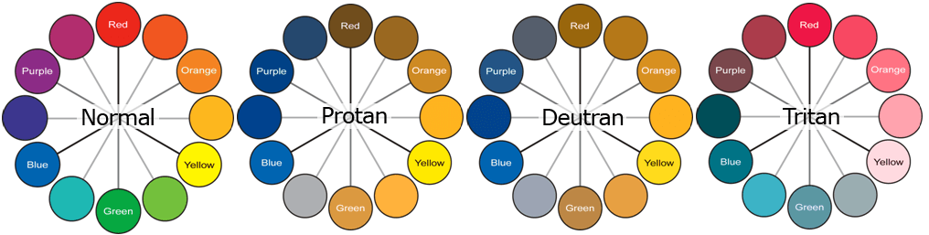
Color vision deficiency variations. Courtesy of Venngage.
Don’t rely solely on color
Color shouldn’t be used alone to relay information on a website. If there’s a piece of information that’s important for the reader, make sure there is some type of text or icon that can also convey that same message if someone is using the site on a monochrome display or cannot see color.
Test your website for website accessibility
When in doubt, test it out. Use simulators to put yourself in other people’s shoes. By using a color filter, you can test your website against different color vision deficiencies. There are three main types of color deficiencies to consider: red/green, blue/yellow, and complete color blindness. Within each of these categories there a few variations.
Deuteranomaly is a type of deficiency that makes green look more red, protanomaly is a type that makes red look more green, and protanopia and deuteranopia mean someone is unable to tell the difference between red and green at all. You can test your site against different types of color vision deficiencies on this site.
Aside from bringing in more traffic to your site and fostering a content experience that is inviting and inclusive, depending on your regional requirements there can be significant consequences that come with non-compliance. Your organization could risk a hefty fine for violating any of these guidelines, which are regularly updated and expanded – with different geographies considering or enacting new legislation in 2021. It’s important to do your research and stay current on what the expectations and requirements are for your specific region.
If you have any questions about color accessibility guidelines, WCAG, or choosing the right color palette, reach out to us!
Learn more about accessibility for nonprofit websites

Accessibility Should Be a Priority for Your Website
Accessible digital experiences needs to be the default this year, not the exception.


Principles of Web Accessibility: Designing A Website For Everyone
The most important thing you can do to ensure an inclusive website is to think about accessibility throughout the project: from content strategy to wire-framing to design to development.
Automated vs Manual Accessibility Testing: How to Make Your Digital Products Usable to Everyone
Accessibility can be tested by running your system through an automated program designed to point out any errors, bugs, and missing accessibility requirements.