
Website
Accessibility Should Be a Priority for Your Website
Accessible digital experiences needs to be the default, not the exception.
Many conversations happening at social change organizations right now revolve around the roles we must play in designing and realizing a more inclusive, equitable, and accessible future.
How we remove the barriers that prevent people with diverse abilities from navigating the Internet — a place we all need access to in order to live, learn, and work — is a crucial part of those conversations.
Creating web experiences accessible to people with diverse abilities is especially important for nonprofits and social change organizations whose values include inclusivity and whose missions involve reducing systemic barriers for marginalized populations.
Sixteen percent of the global population lives with some form of disability. By not considering this segment’s needs in the design or development of digital experiences, organizations risk losing them as customers, donors, community members, and allies.
“Accessible design is a design process in which the needs of people with disabilities are specifically considered,” according to the Do-It Center.
“Accessibility sometimes refers to the characteristic that products, services, and facilities can be independently used by people with a variety of disabilities.”
At Briteweb, we know accessibility is imperative and should be fully integrated into our processes, rather than simply tacked on at the end. We hope and predict that accessible digital spaces will shift to become the default experience, and not the exception.
These are the accessibility focus areas we’re championing in 2024:
A focus on the ideal user experience through the lens of accessibility
An accessibility-first approach always improves user experience. Designing for accessibility is the best way to optimize the overall user experience, for people who are living with disabilities and for those who are not.
Consider how people try to watch a video on their mobile phone while riding on a noisy, crowded bus. They don’t have headphones, or a desire — or ability — to turn up the volume in a shared public space. Accessibility standards that help a diversity of users consume the video content — automated transcription, subtitles, closed captioning (CC), or correct colour contrast ratios — will benefit anyone trying to watch it and create a better digital experience, whether or not they are a person with a disability.
Writing sequentially, instead of spatially
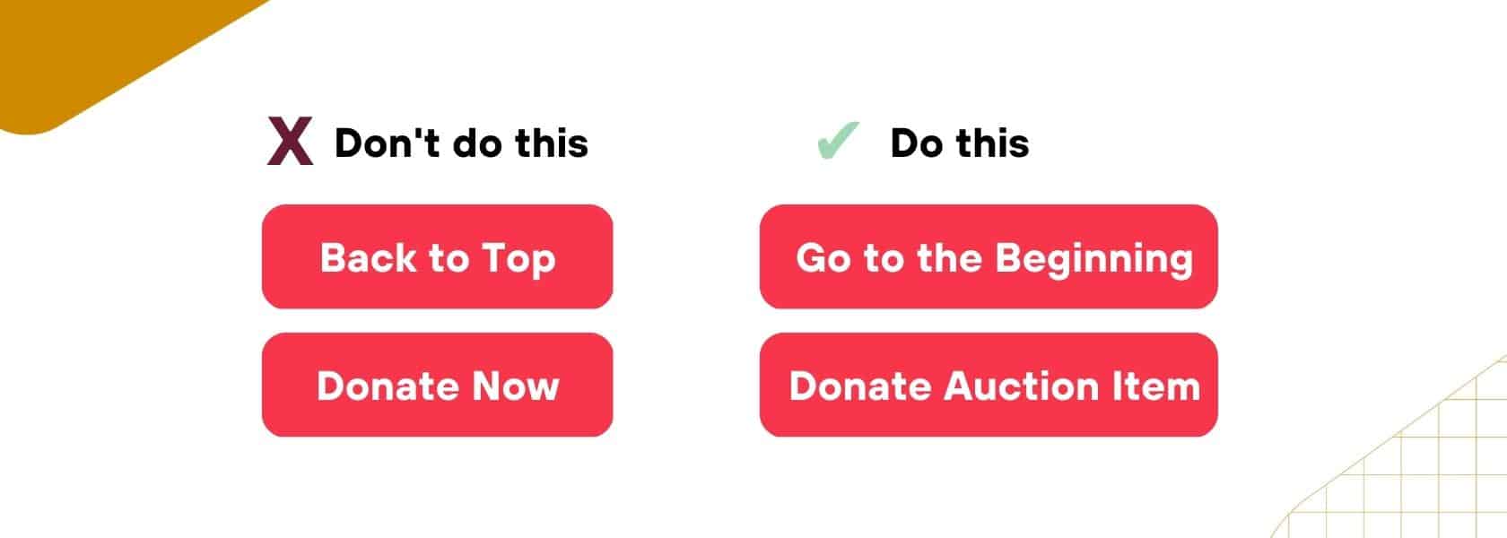
Designing with screen readers in mind means moving away from writing and designing pages spatially, and instead providing directions sequentially. Spatial directions show up in copy like this: “on the left” or “go to the top.” This copy is confusing or ineffective for a visually impaired person using a screen reader.
In the case of “go to the top,” it’s not clear where we mean. A sighted user probably assumes that we’re returning to the view that’s above the fold. But for a user with a screen reader: are we going to the menu? To the H1? To the opening <p> tag below the H1?
When you take into account the different ways people are consuming content, that’s where we see the need to create sequential or chronological copy. Writing chronologically takes into account the sequence of actions a person will take on a web page and how we must reframe the directions we’re providing to make the site functional.
We can do this by using copy that adds more context or explains the benefit of clicking a link or button, such as “go to the beginning” or “select OK to register.”
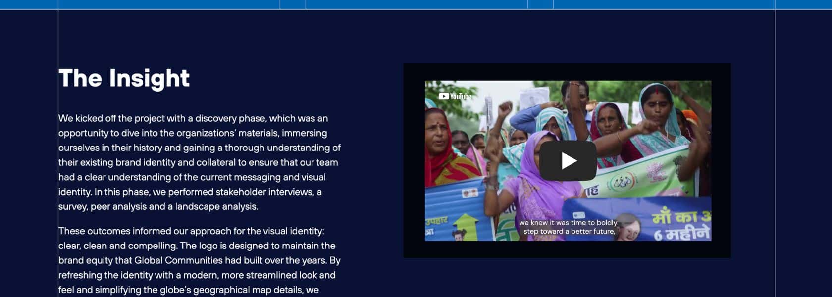
Choosing hosted video content over embedded video
While many of us have grown accustomed to embedding video content, using an external host is the more accessible and functional option. Too often, embedded video simply doesn’t have the features it needs to be considered accessible. YouTube, as an example, can automatically generate closed captioning, alt-text or subtitles with no additional coding.
Being intentional with headings
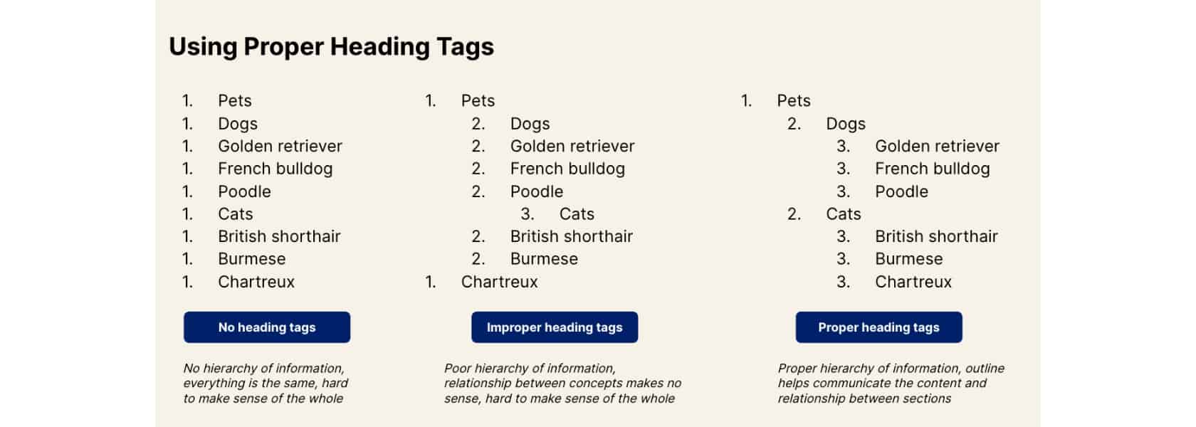
A heading helps a user navigate through and better absorb the contents of a page. A sighted user can visually interpret the hierarchy of headings and content on a page, usually by interpreting the impactful statement or problem in a large font as the main message (H1), because it’s above a paragraph in smaller font (H2) that summarizes how an organization is solving the problem.
A person using a screen reader, however, relies on what tags we have added for each heading. Users of screen readers scan the page by navigating through headings. But if we have four, five or even six of these headings on one page, we lose the hierarchy and it starts to sound like yelling.
As well, design elements that may be visually appealing (like a label above a heading, often called eyebrow text) can also complicate the page order of tags and make the content inaccessible to a screen reader.
Building an accessible website means being intentional with headings and how they are tagged, to ensure anyone interacting with the website absorbs the text according to the same hierarchy. Without the proper tags, the content simply won’t make sense with a screen reader or accurately convey the relationships between the different areas of content.
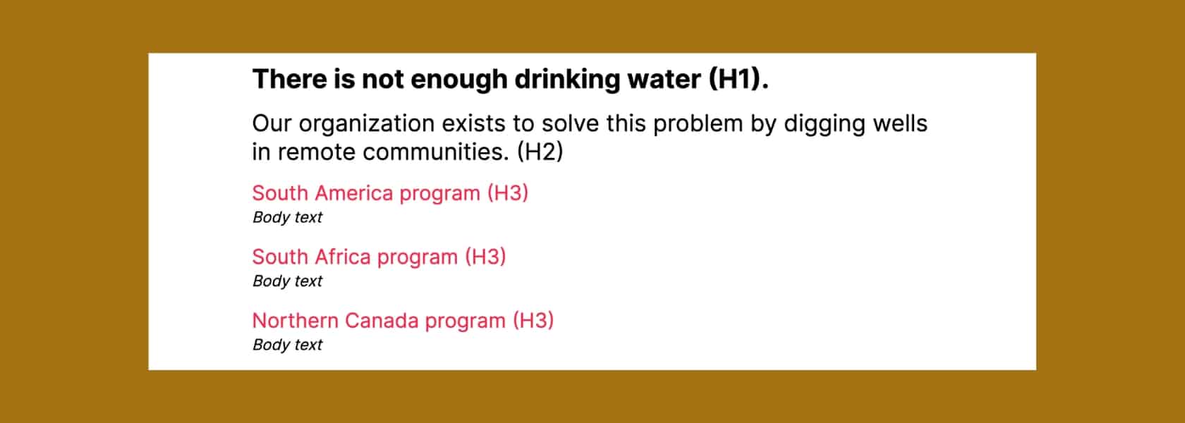
Let’s use a web page dedicated to programs as an example. In this case, we want H1 to summarize the problem and H2 to explore how the organization is addressing the problem, before moving on to showcase three different program areas in the organization. Here’s how the tags should be applied:
Here’s a great visual example of how to use heading tags:
Considering colour and contrast
To make the web accessible, it’s the responsibility of each individual organization, company, and business to make sure their site continually meets specific compliance criteria. There are guidelines for different places in the world, with region-specific resources that will apply differently to different organizations. Web Content Accessibility Guidelines (WCAG) are the standards most people use as a reference for Americans with Disabilities Act (ADA) compliance.
When it comes to colour palettes, ADA compliance means that colours on a website are chosen in a way that’s easily read and understood by everyone. When choosing a colour palette for your site, you’ll want to consider choosing two high-contrast shades.
In the context of building a brand, it’s wise to consider ADA-compliant colours as in the initial stages of developing the brand, so that you avoid choosing colours that simply aren’t compliant and having to start from scratch.
Rethinking implications of opening new tabs
While it used to be considered best practice to always open an external link in a new tab, the experience can be jarring for someone without a visual experience of the website or who isn’t expecting a new tab to open. In the context of accessibility, it’s worthwhile to consider why we’re imposing this behaviour on others, and whether doing so makes the digital experience less positive for people with disabilities.
If you must open a new tab, consider making it a more accessible experience by finding a way to alert the user of what’s happening in the moment on the hyperlink itself or by hard coding an icon.
Partnering directly with accessibility experts
Collaborating with people and organizations who have lived experiences of disability and expertise on how to navigate barriers will help create better design and build digital experiences that are accessible.
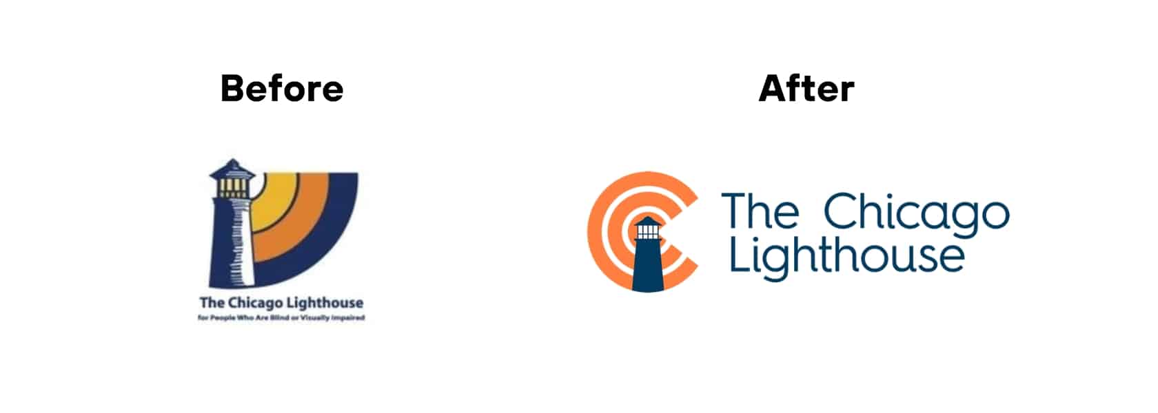
The Chicago Lighthouse, a U.S. organization serving the blind, visually impaired, disabled and Veteran communities, offers consulting services to help businesses and other organizations develop digital properties that offer an optimized user experience for people who are blind or visually impaired.
Let’s not just tick boxes. Let’s create a more accessible future.
Building accessible websites is part of a meaningful conversation about how we ensure a large segment of our population can access digital experience, rather than simply an ADA compliant box to tick.
It’s an opportunity to examine our biases and affect change through strategies, words, and designs that ultimately draw more people to your mission and include them in your advocacy.
Looking for help making your next digital experience accessible? Book a meeting with Briteweb to chat.
Get more insights like this

Foundational Principles for Building Successful Social Impact Websites
Your website should be where your digital presence converges to help you connect with your audience and further your mission.
Automated vs Manual Accessibility Testing: How to Make Your Digital Products Usable to Everyone
Accessibility can be tested by running your system through an automated program designed to point out any errors, bugs, and missing accessibility requirements.

Let’s Talk Consentful Design
With so much of our lives being digitized, we often don’t realize what it really means to be giving up personal data on the web.